

Branding
Client
again
Jobs
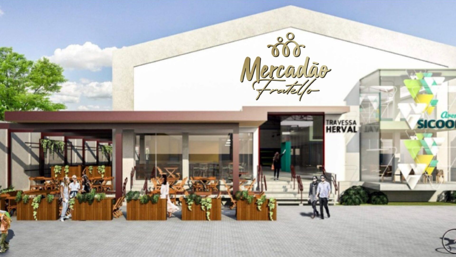
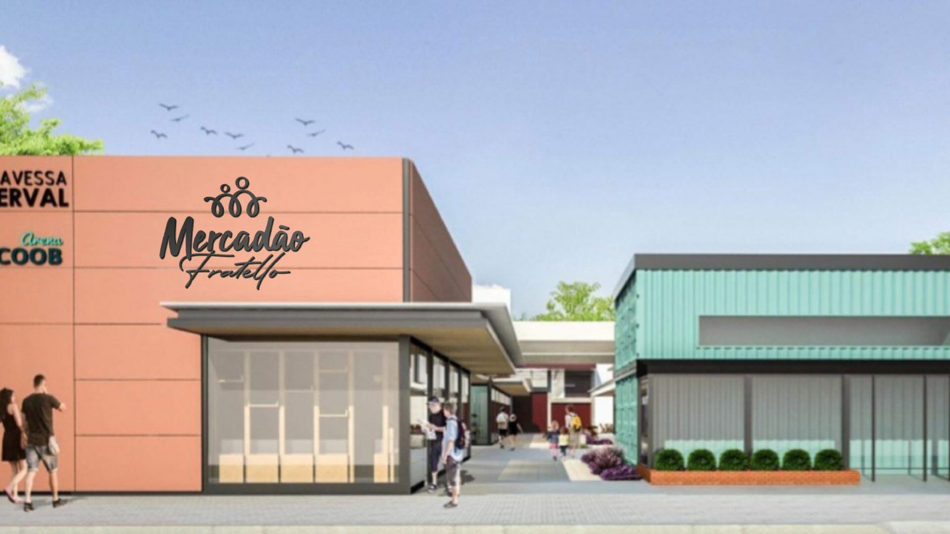
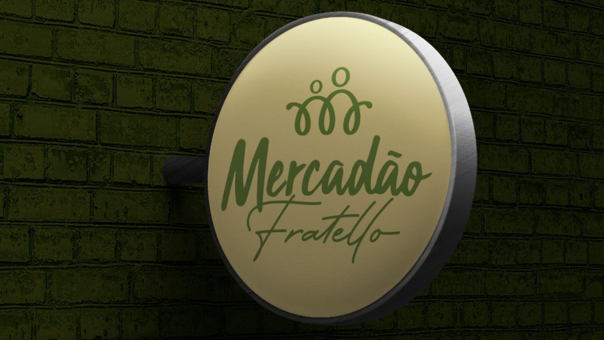
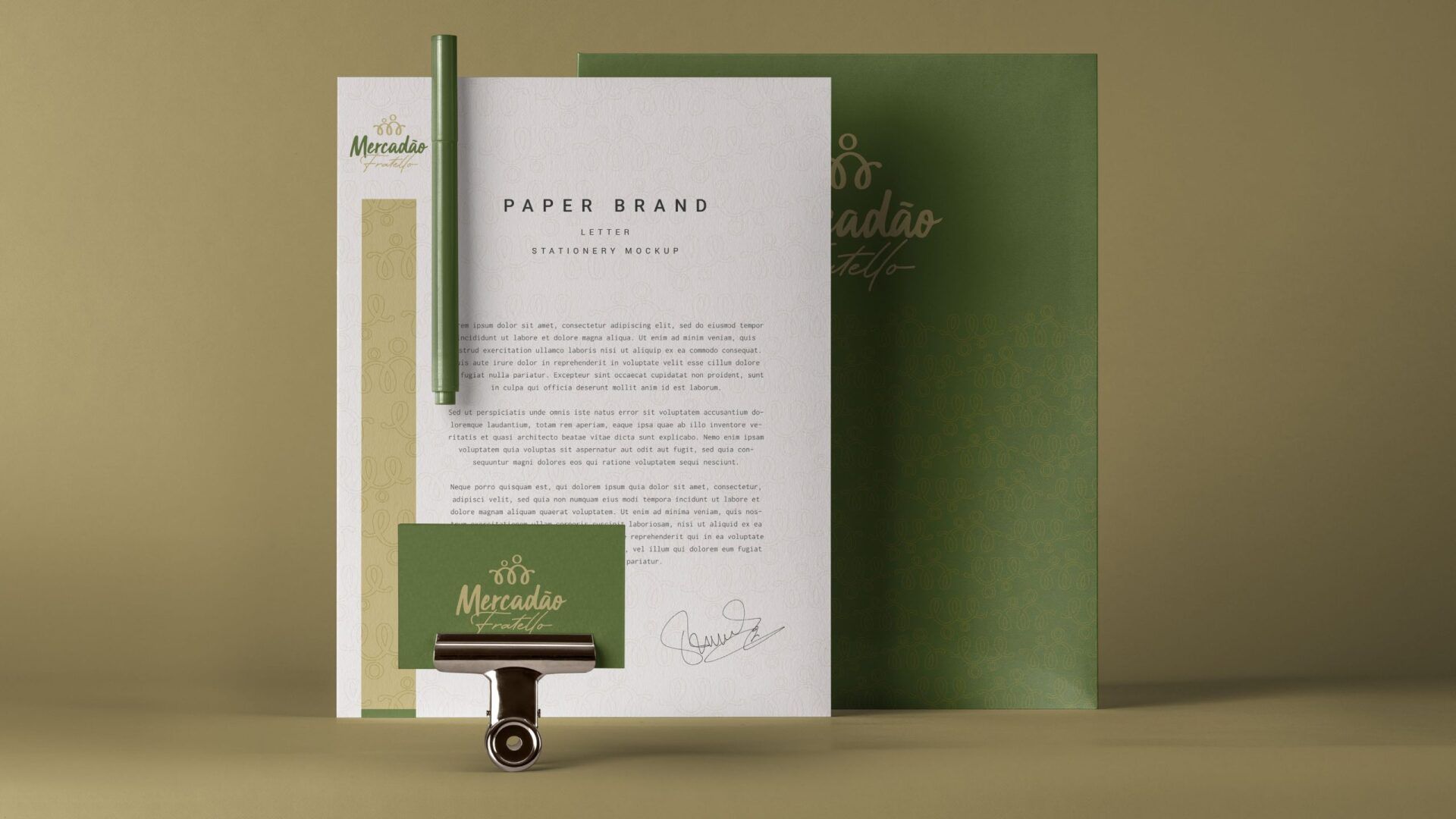
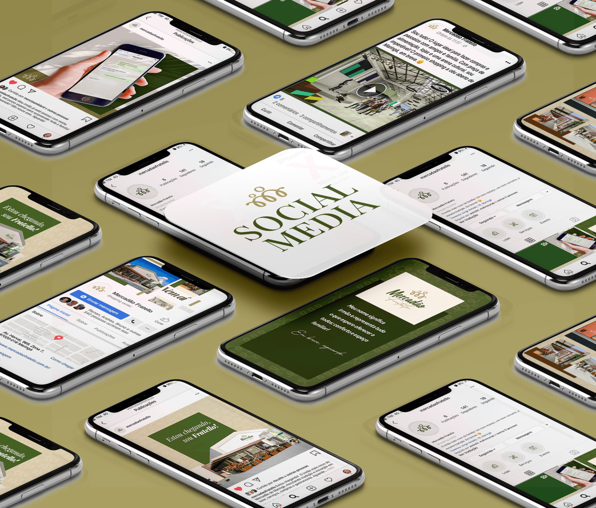
APPLICATION MANUAL MOCKUP SUGGESTIONS

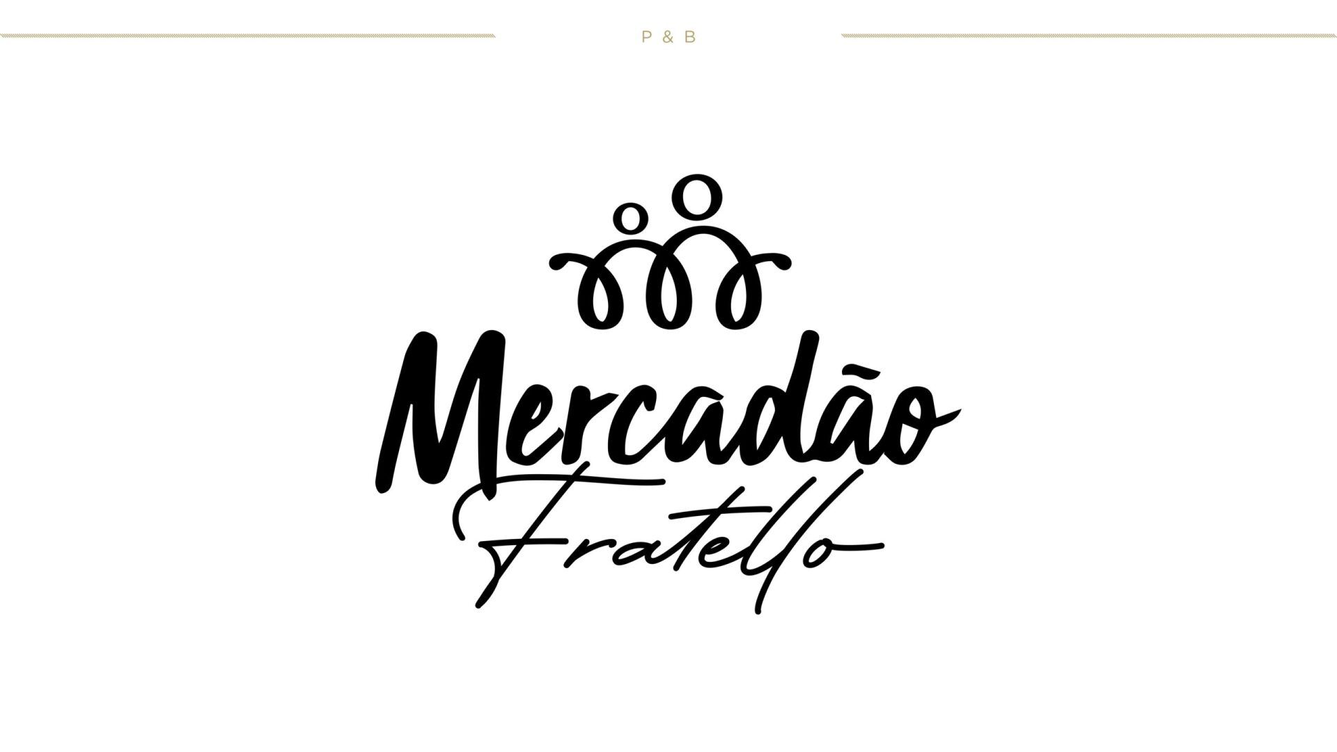
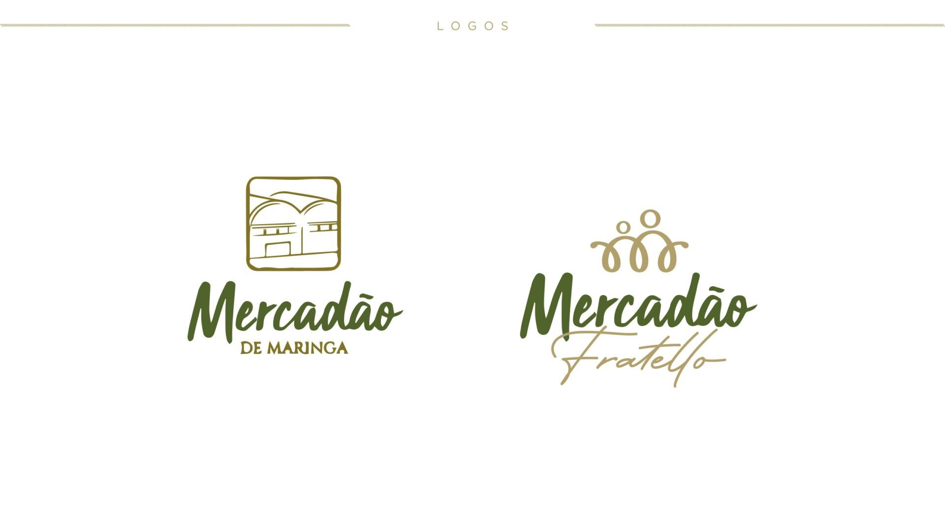
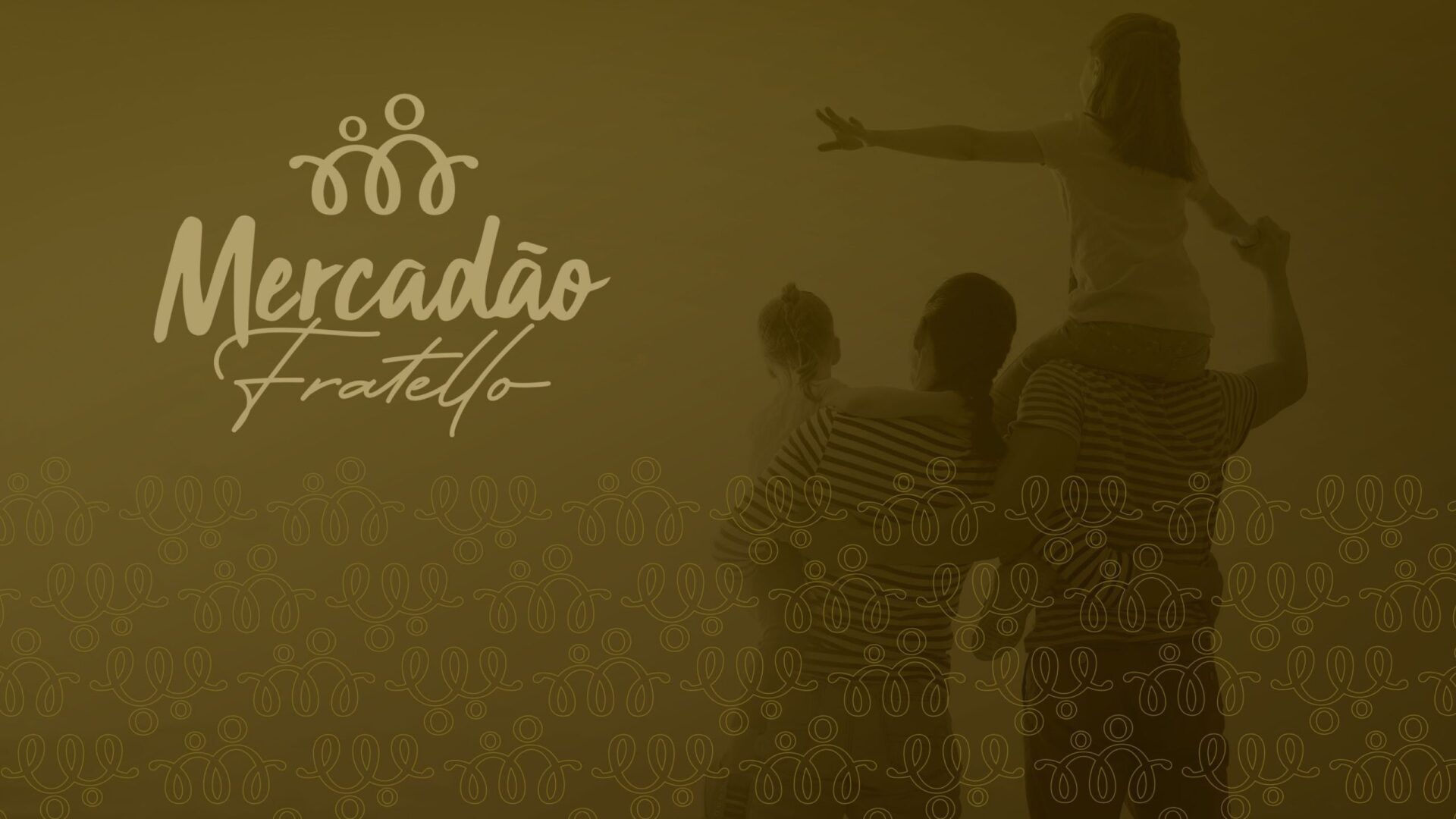
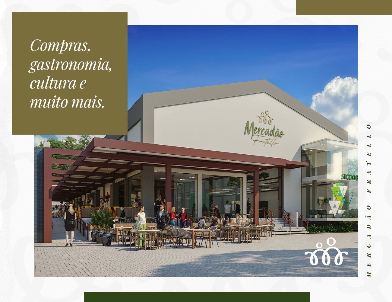
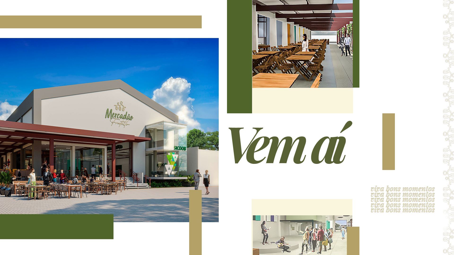
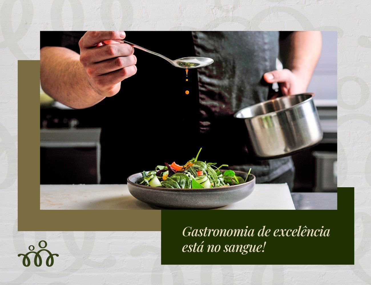
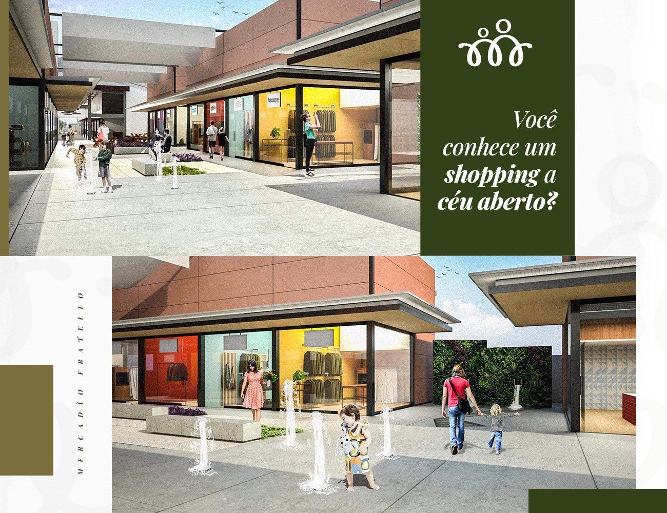
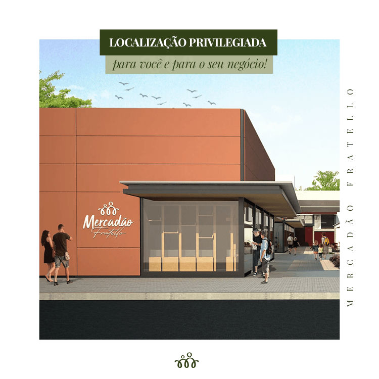
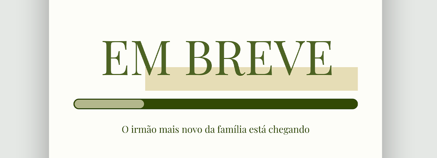
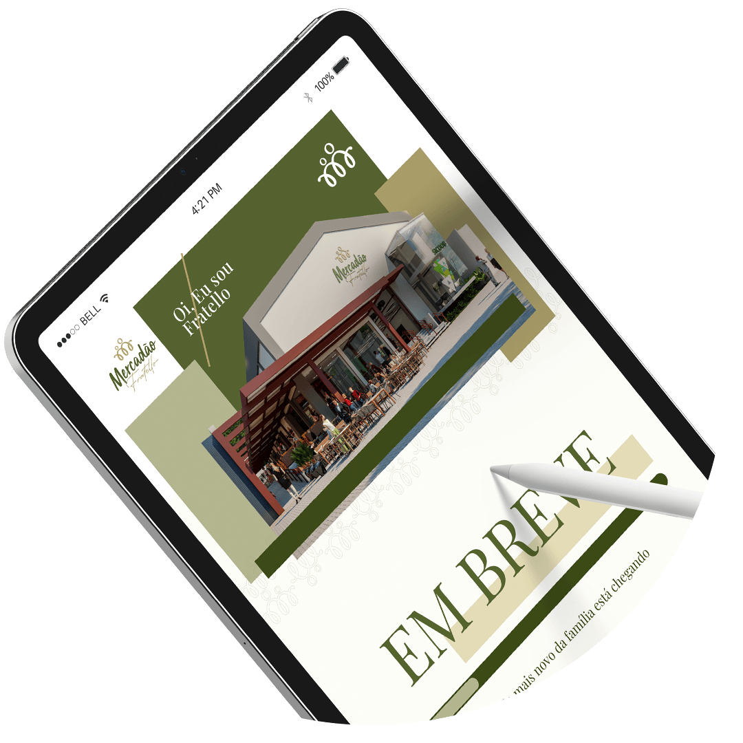
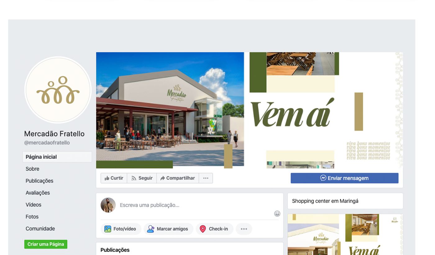
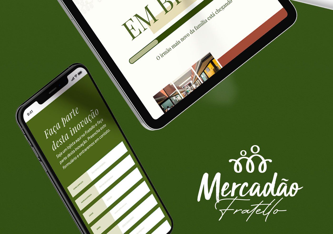
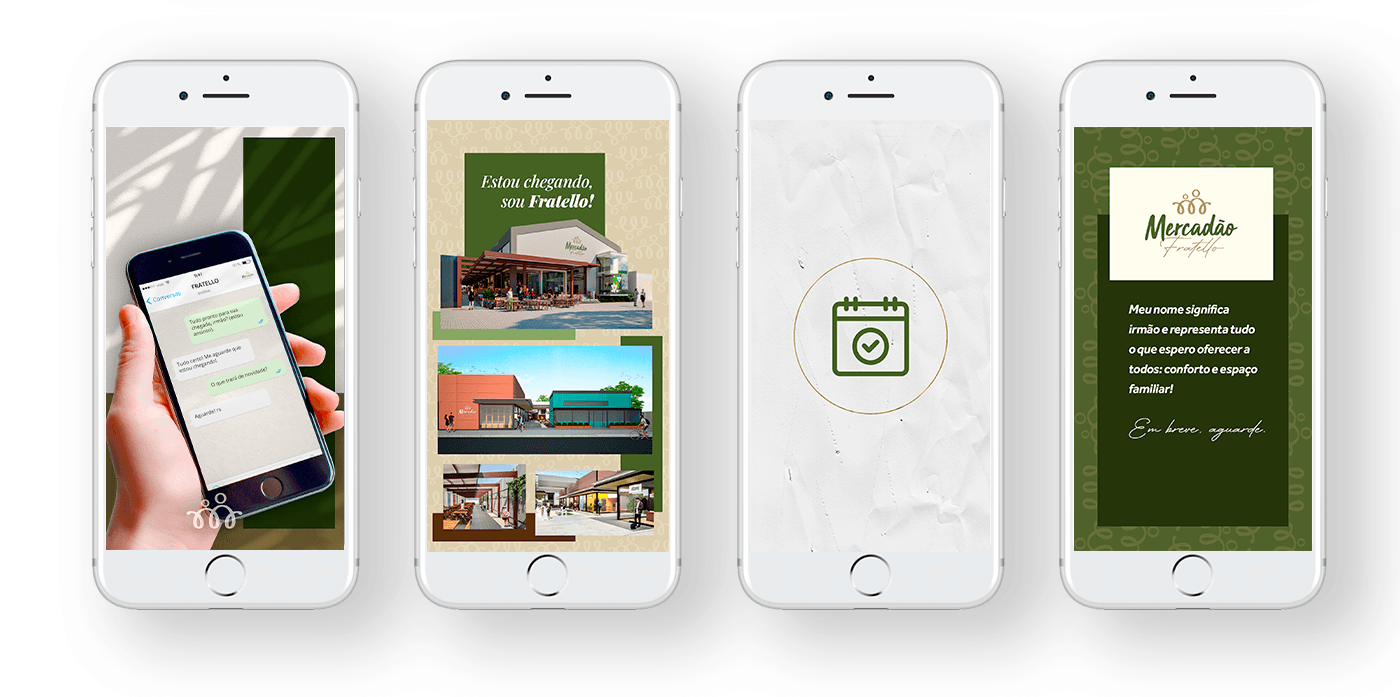
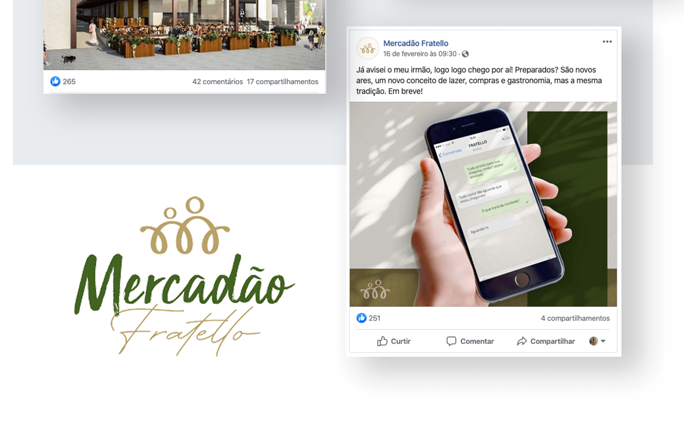
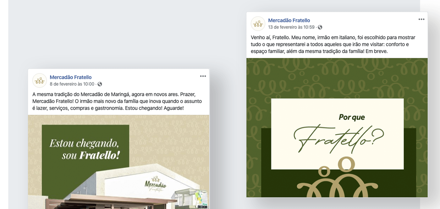
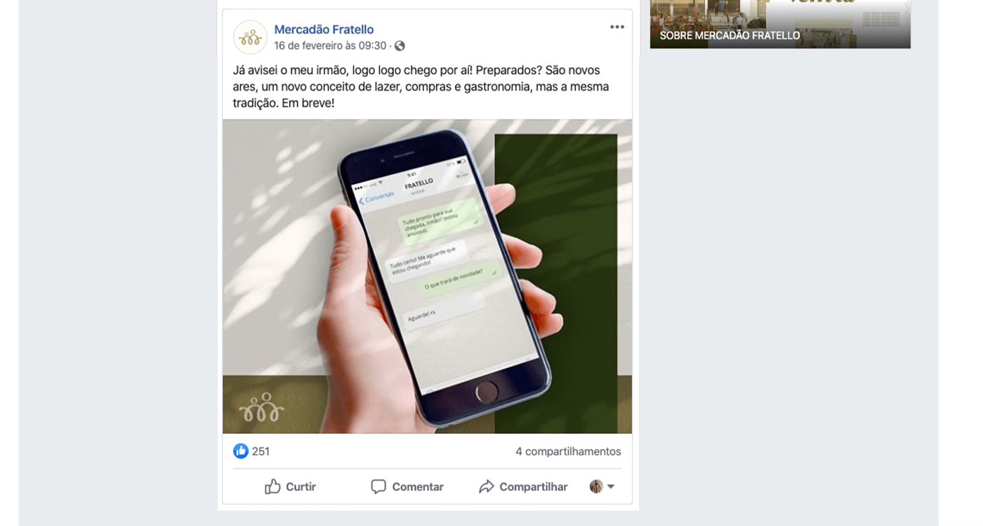
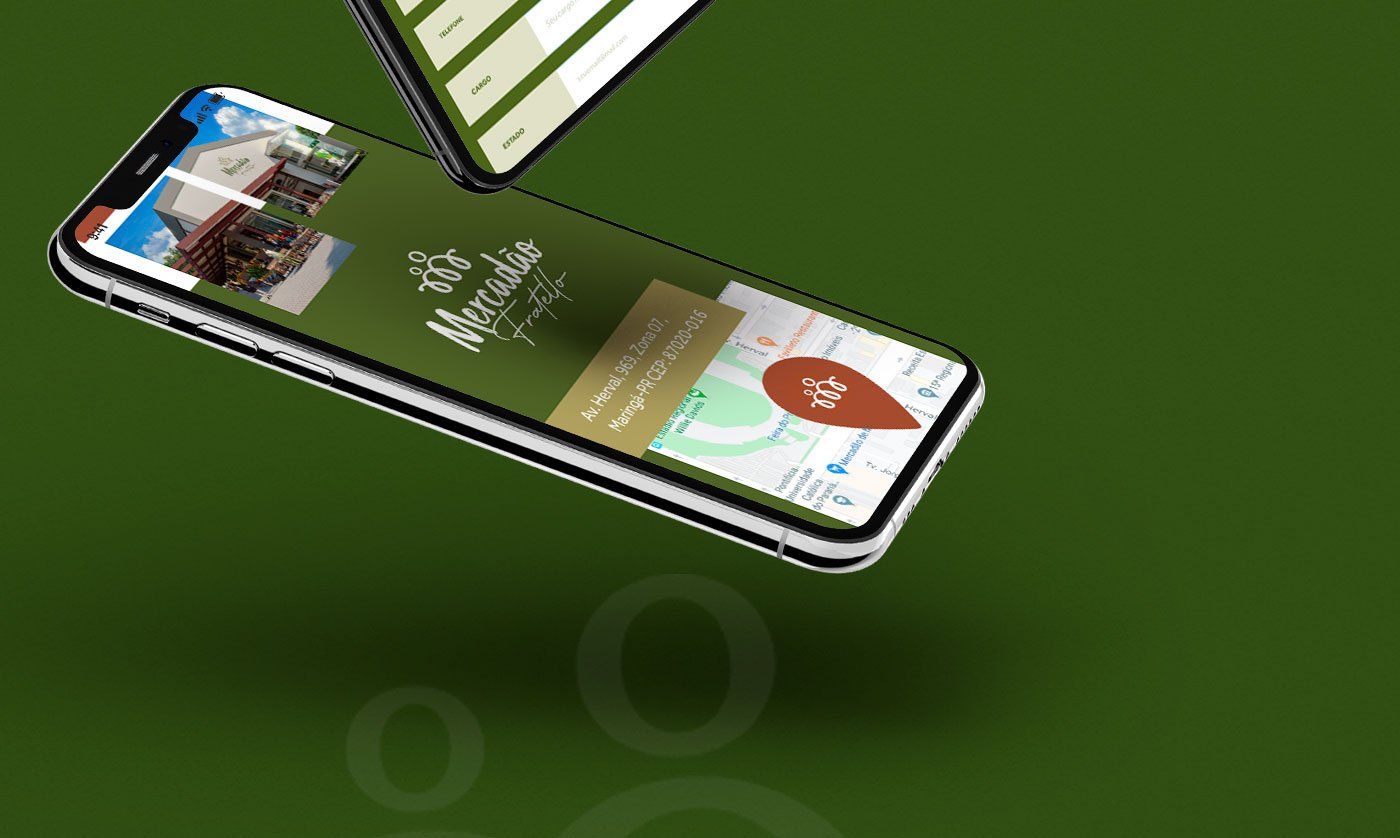
Mercadão Fratello arrives to bring a different gastronomy, but with the same tradition and quality as the Mercadao de Maringá.
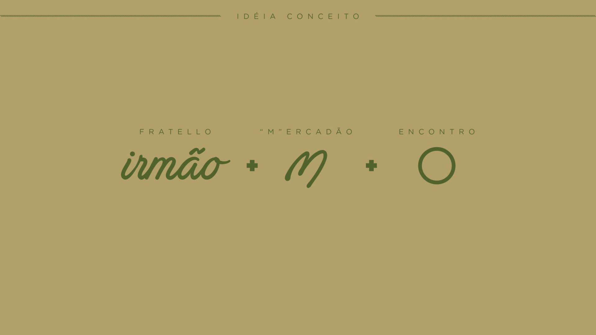
Fratello means “brother” in Italian and refers to the company's concern to continue offering haute cuisine and a family space.
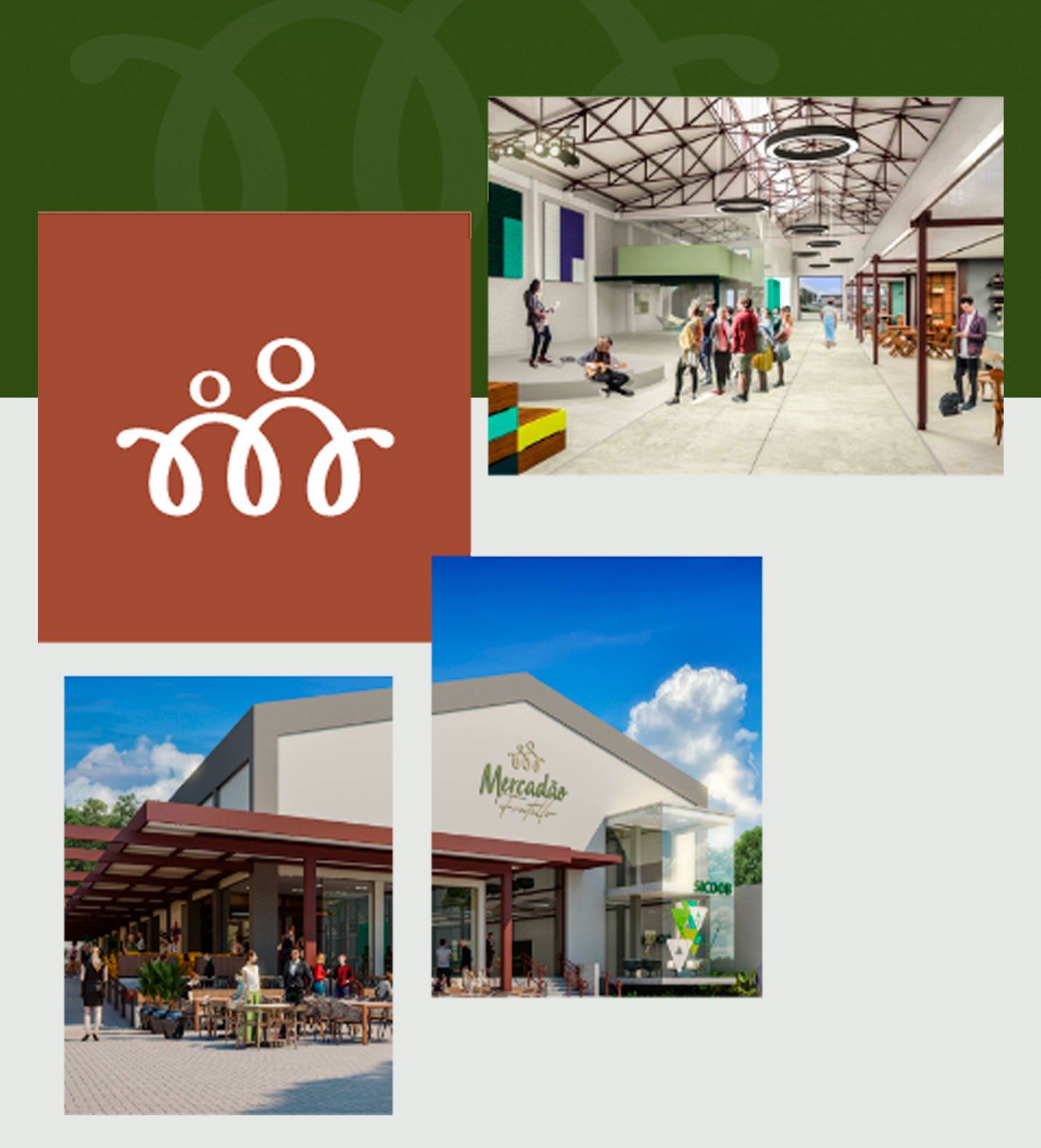
To reflect this commitment, it was necessary to develop a logo. The novelty, in addition to imposing the company on the local market, manages to portray the essence of the business.
Based on this assumption, the visual identity is based on the fundamental tripod: fraternity, the welcoming environment and the quality of customer service.
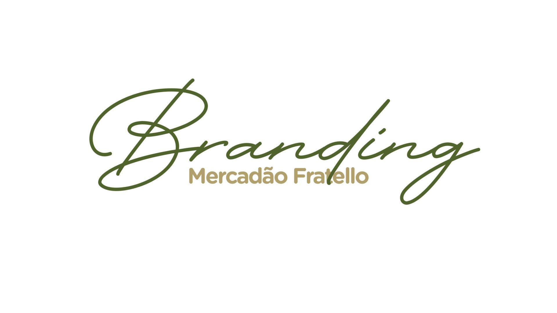
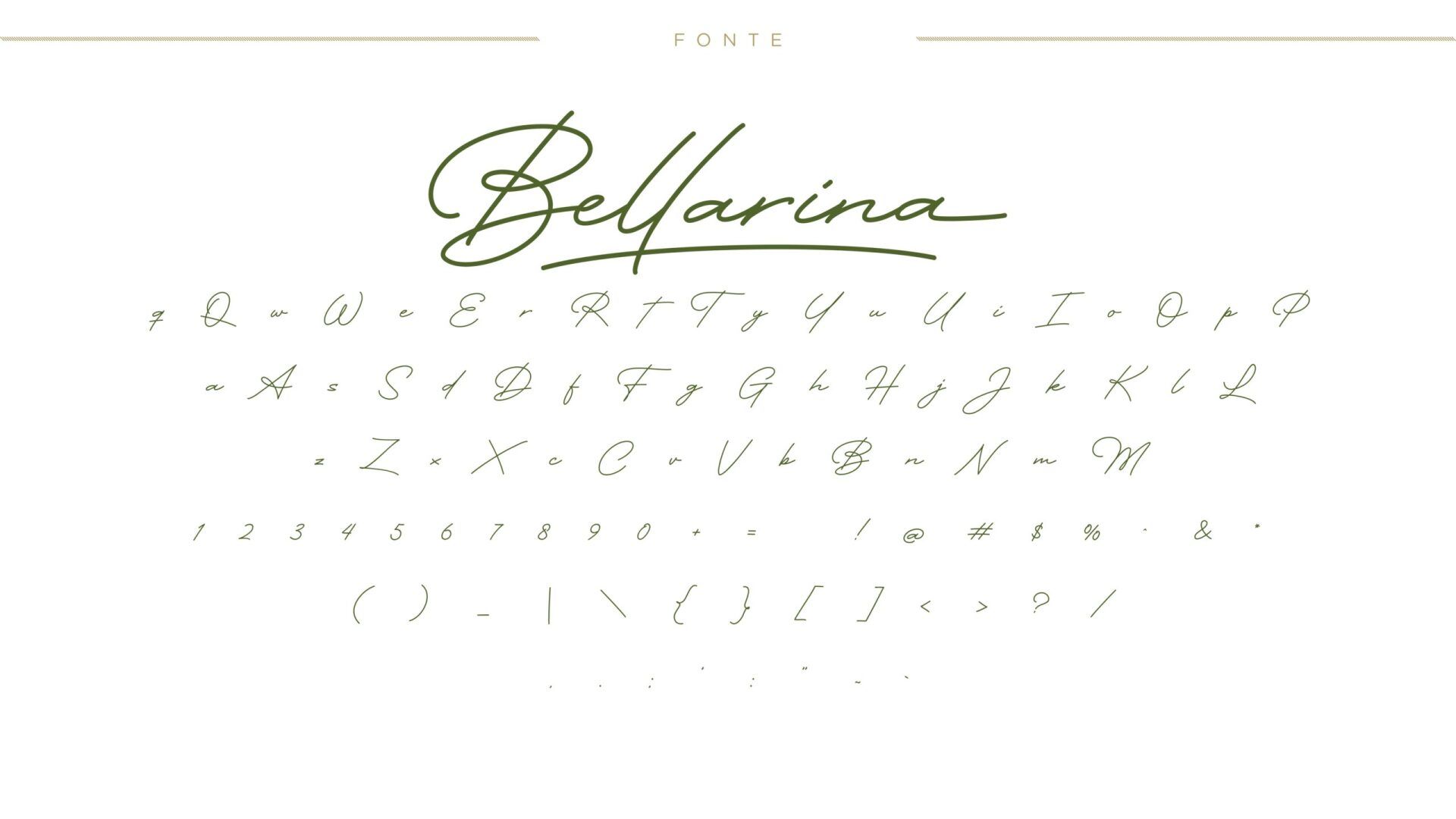
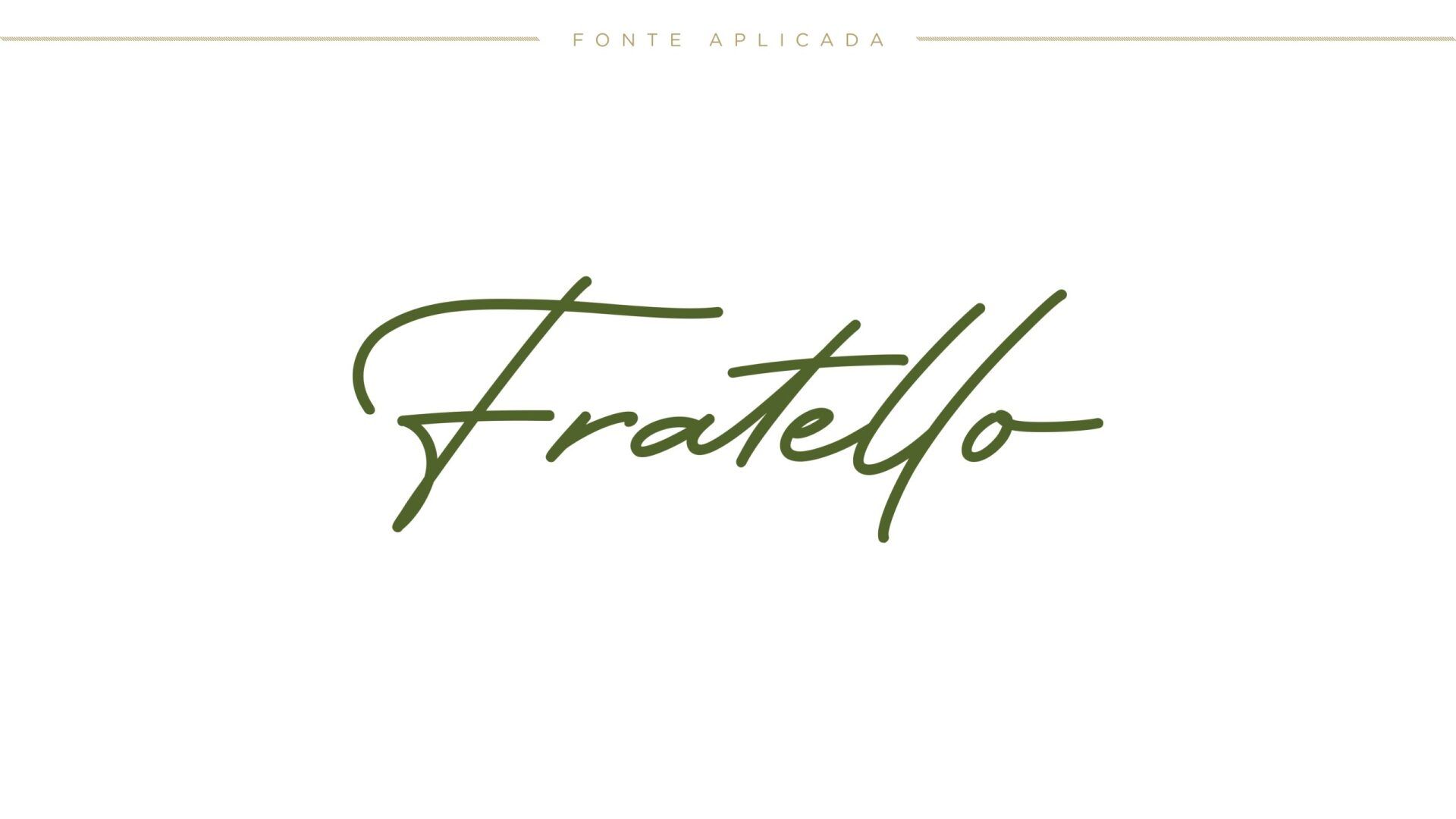
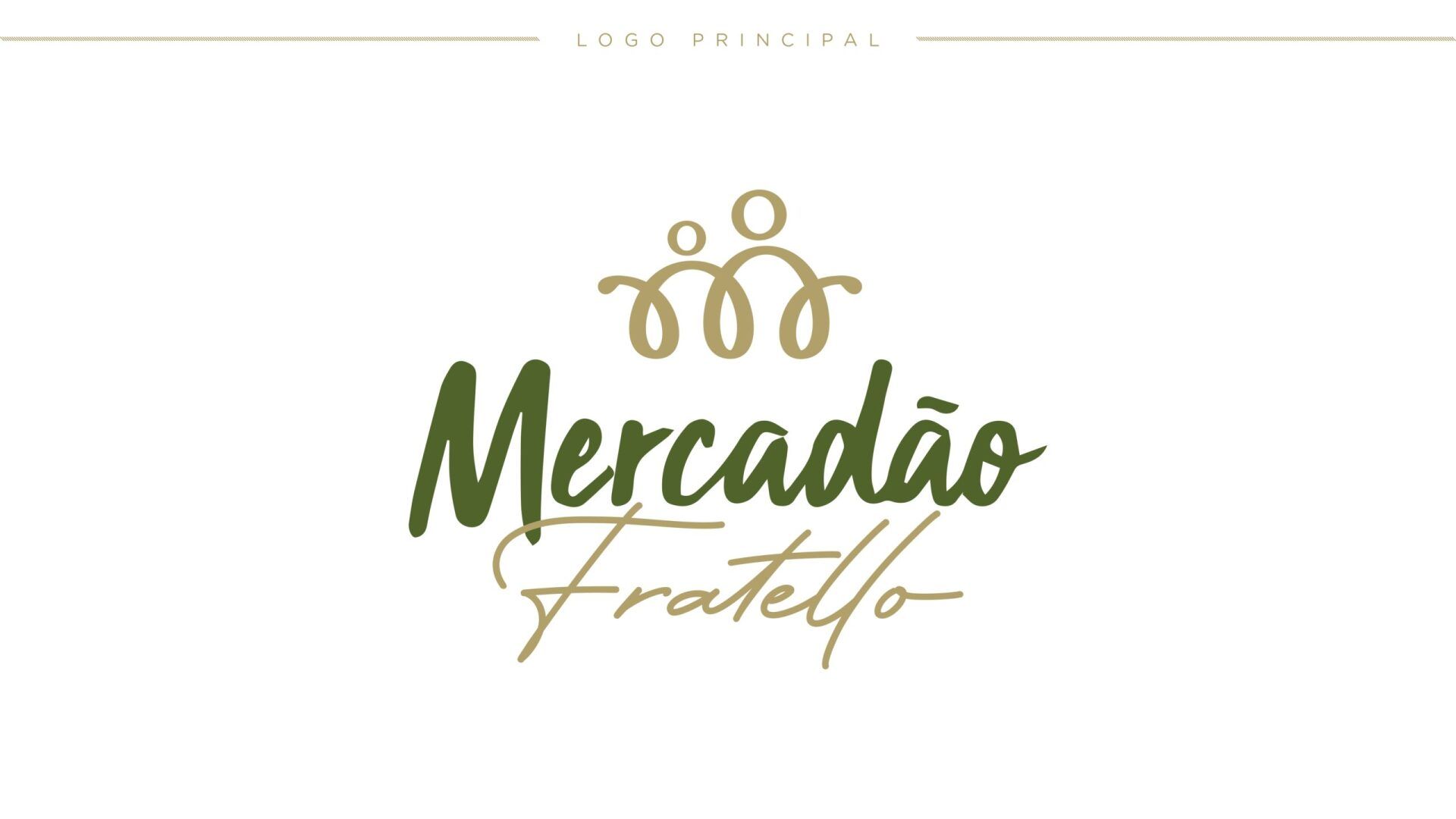
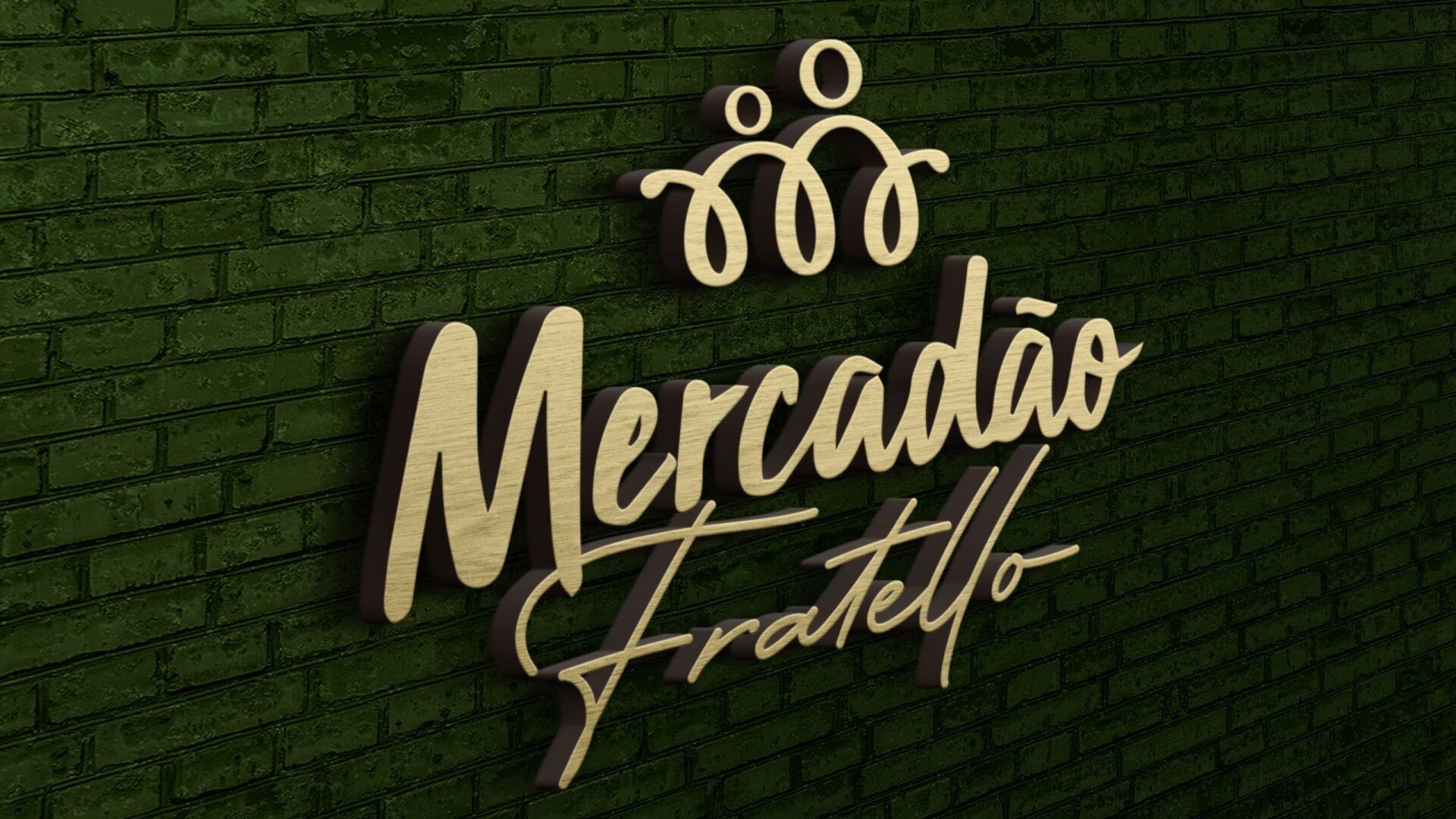
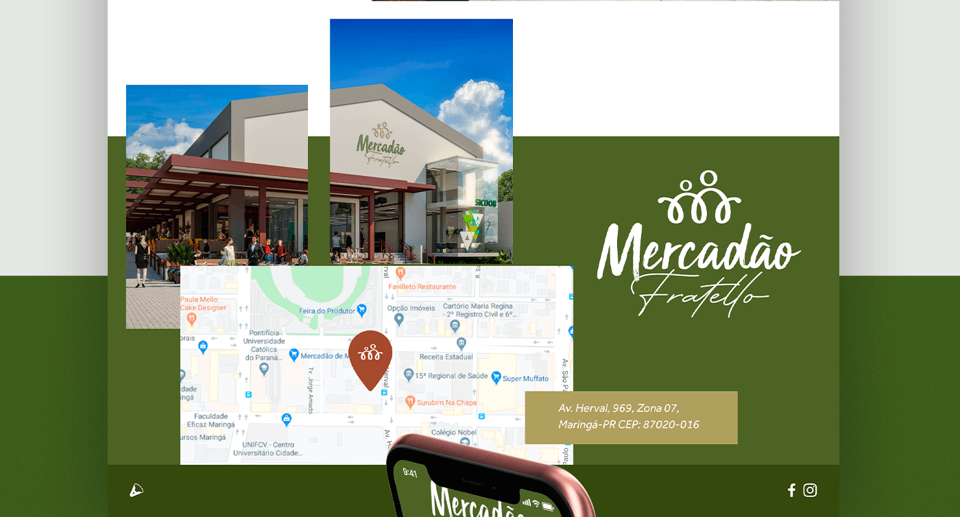
The company's name in full: Mercadão Fratello, brings the foreign word written in Bellarina typography. The letter, in turn, demonstrates refinement and softness in its strokes.
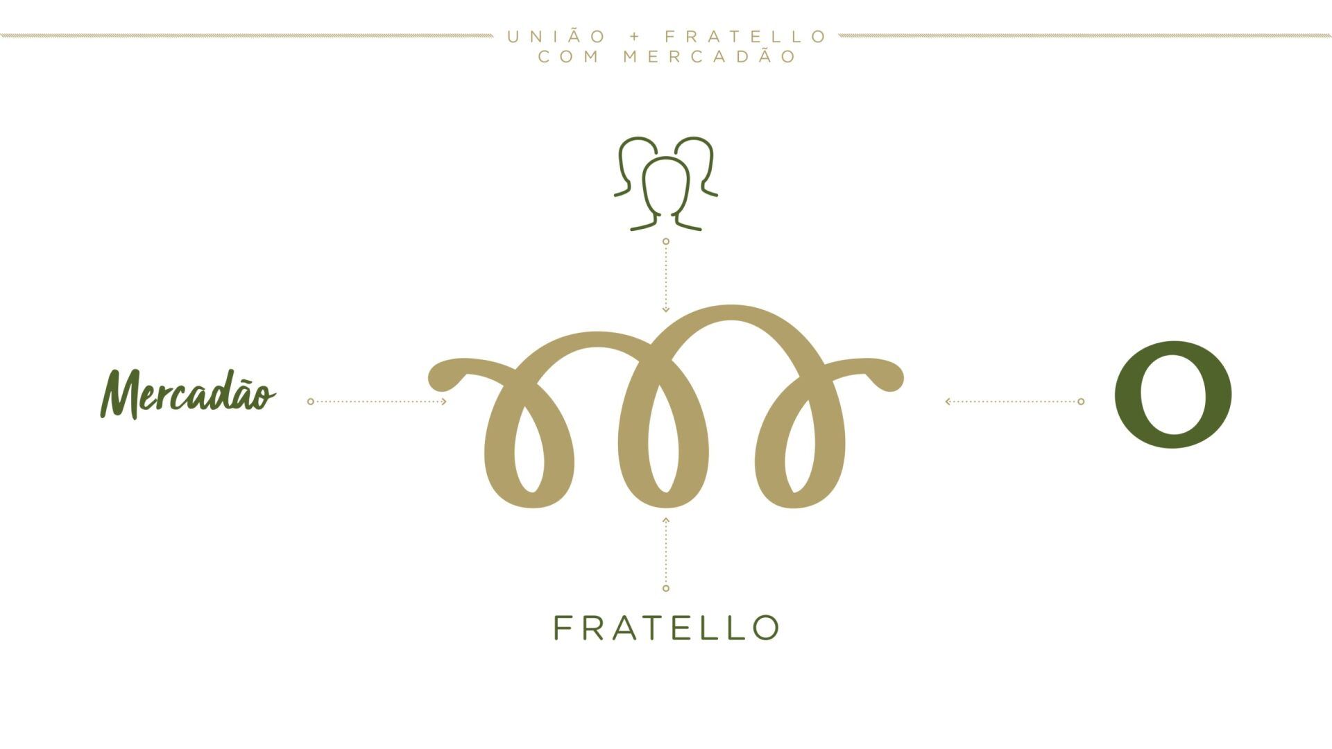
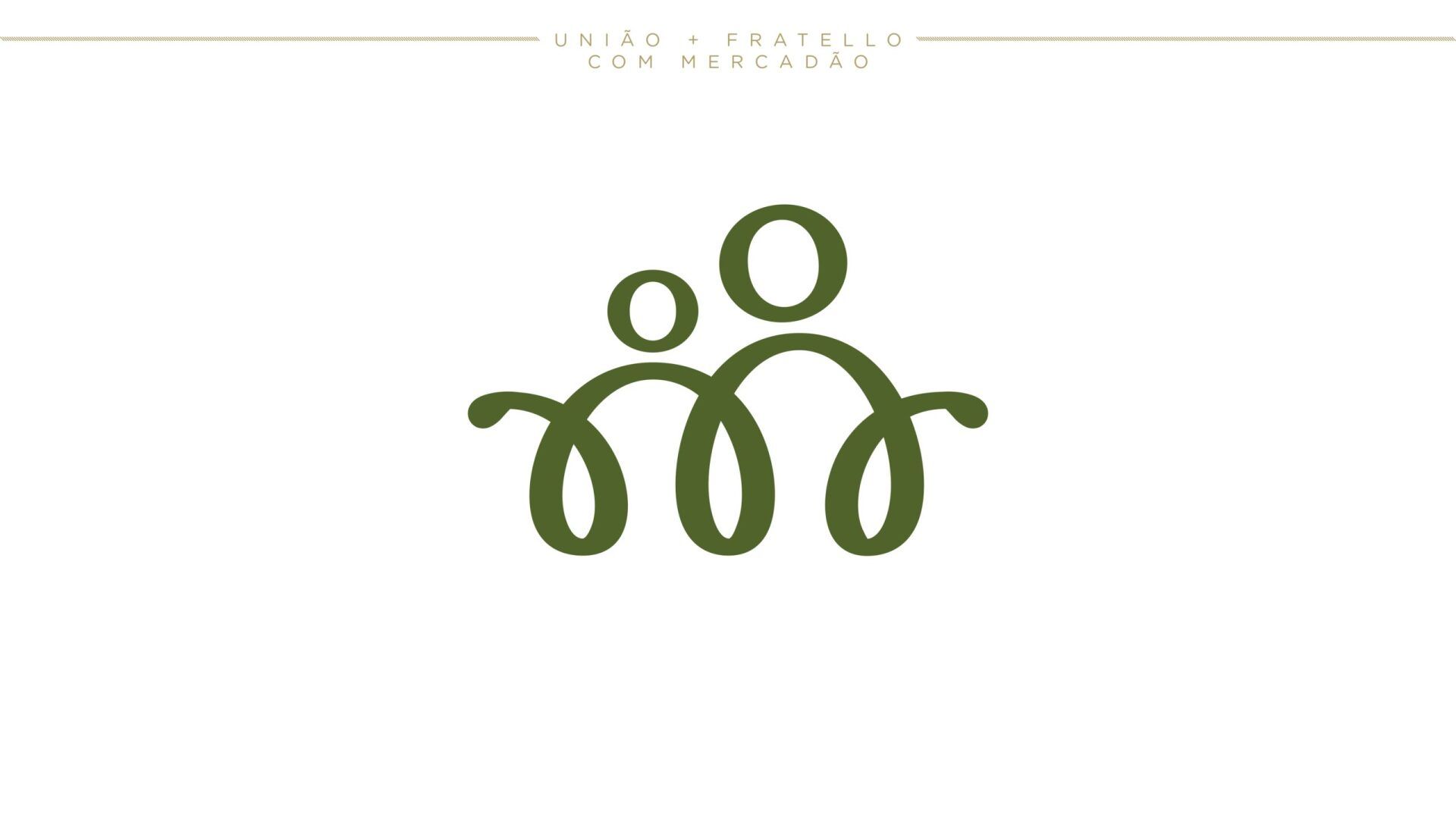
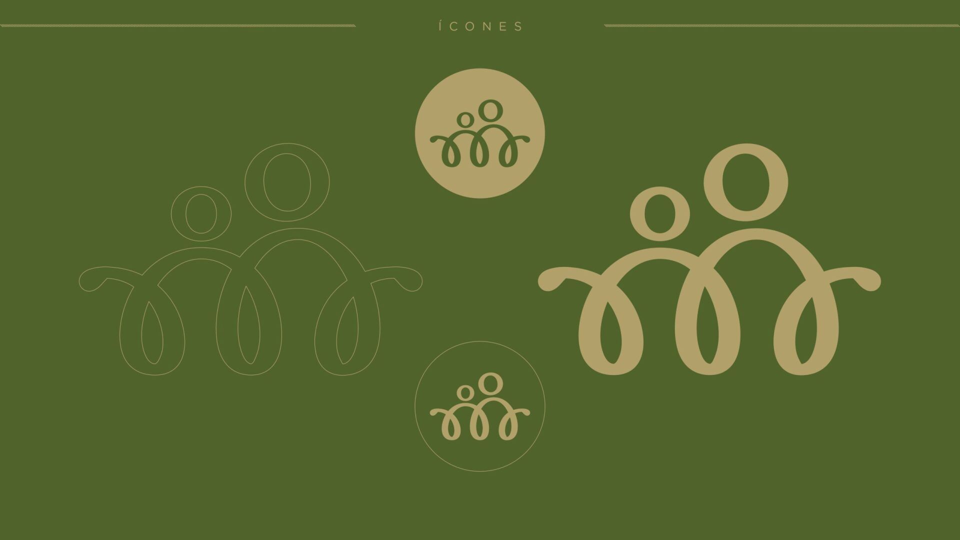
In addition, at the top of the identity, we have an icon that represents the letter “M” of the market in curved lines, which, together with the circles, refers to the human figure and strengthens the idea of fraternal bonds.


DATASHEET
Is your brand positioned correctly?
Have a branding that represents your company and create passionate about it.