

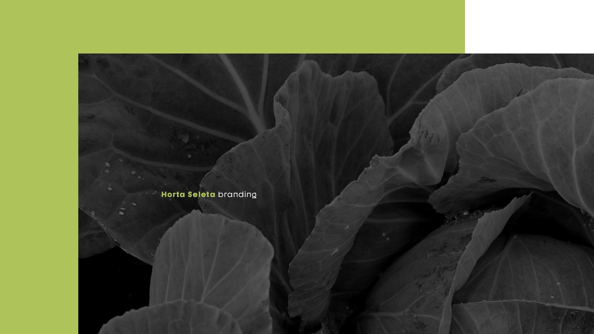
Branding
vegetable garden
Industry
again
2020
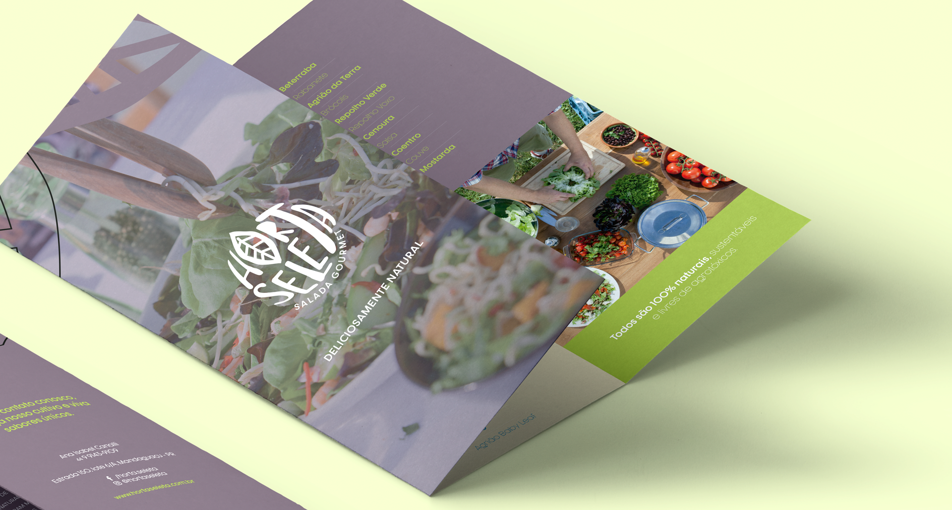
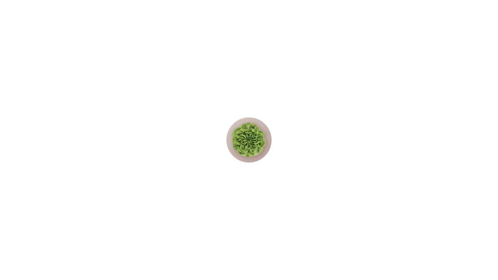
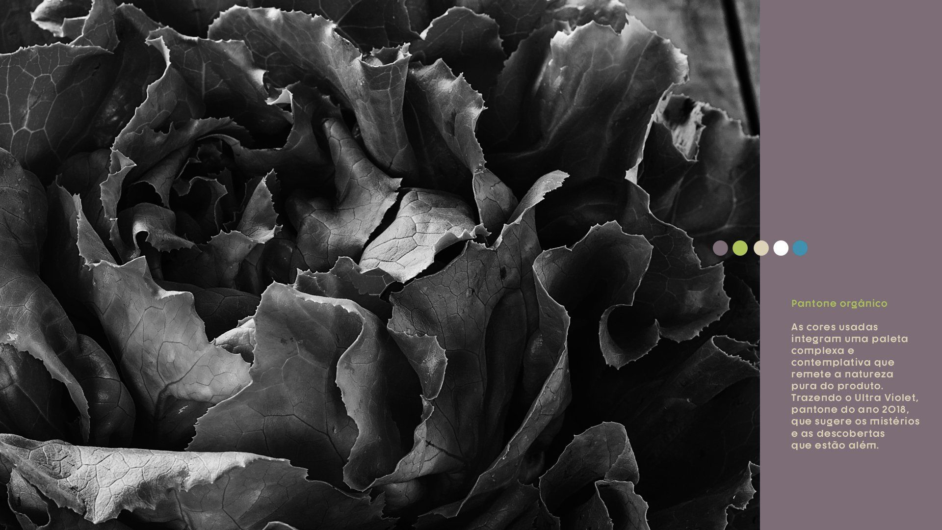
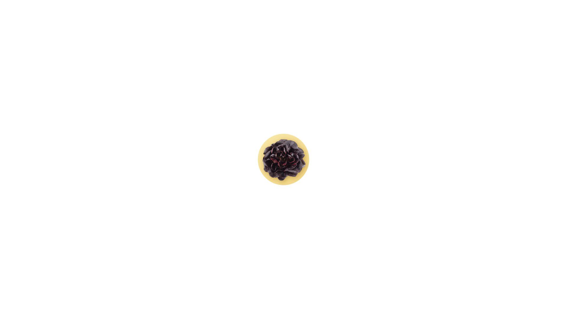
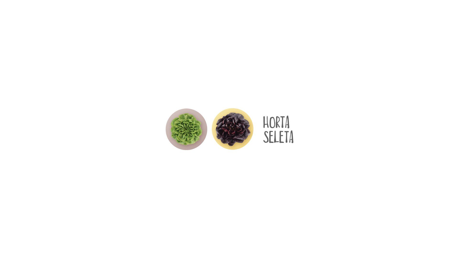
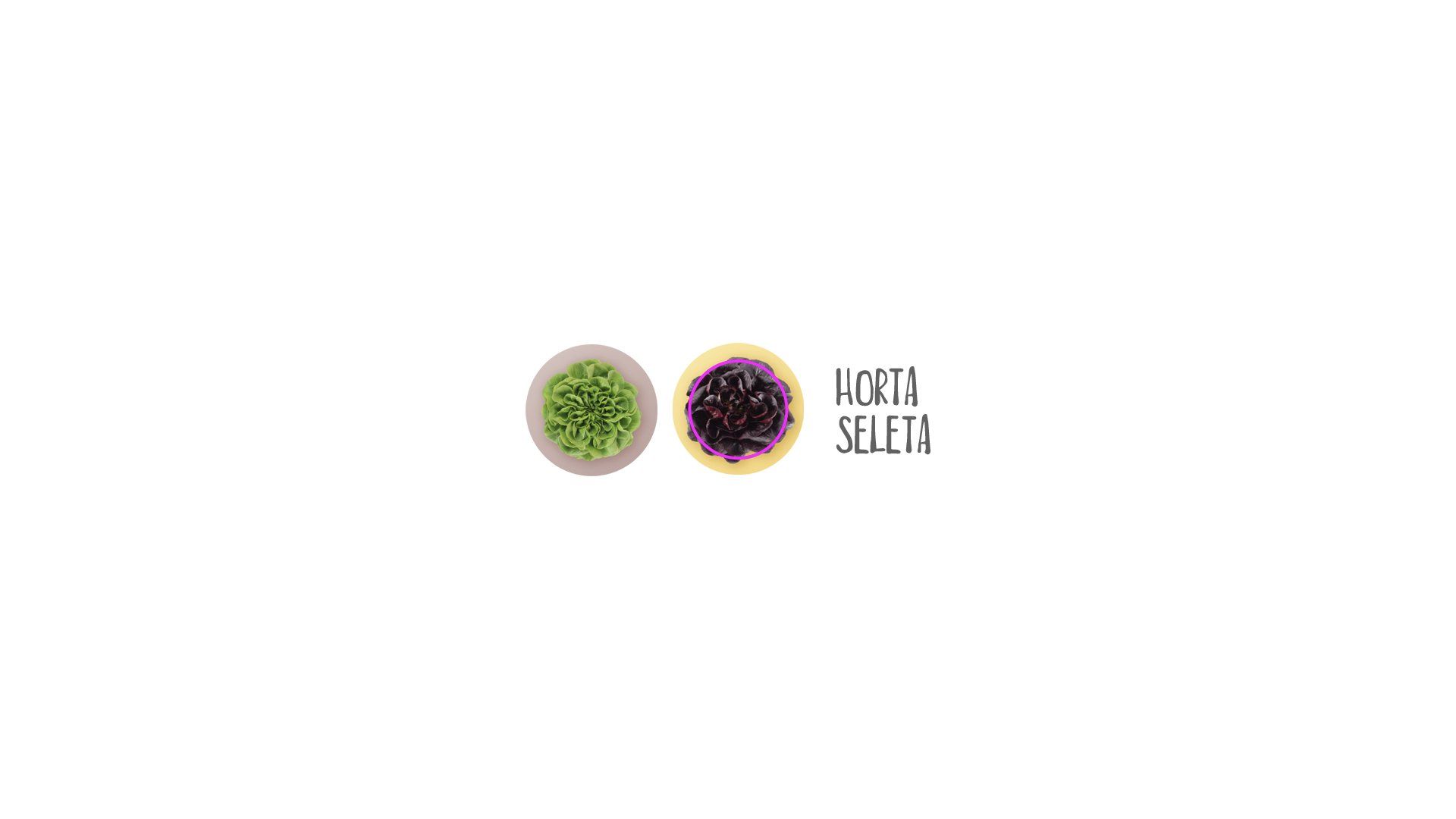
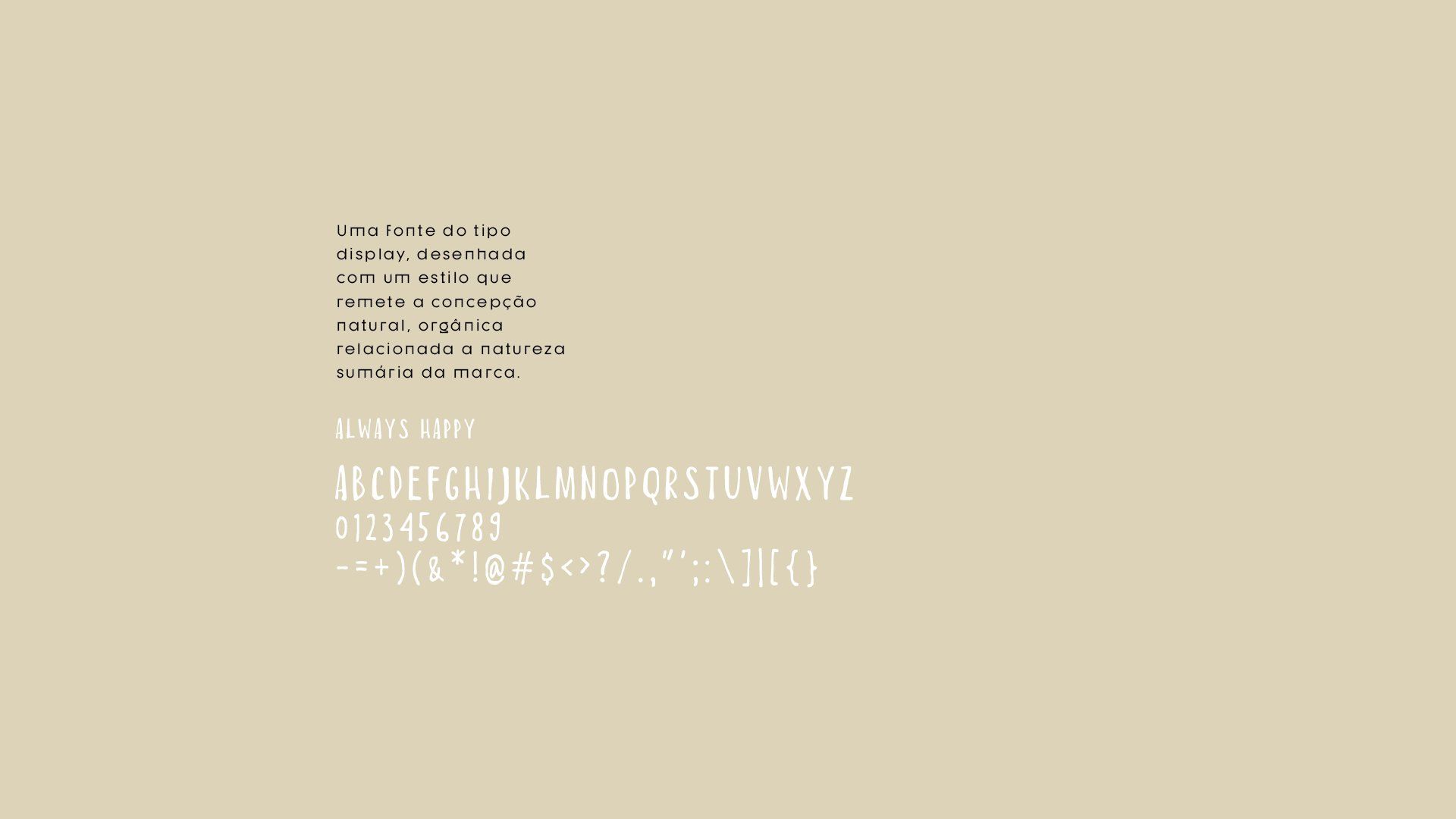
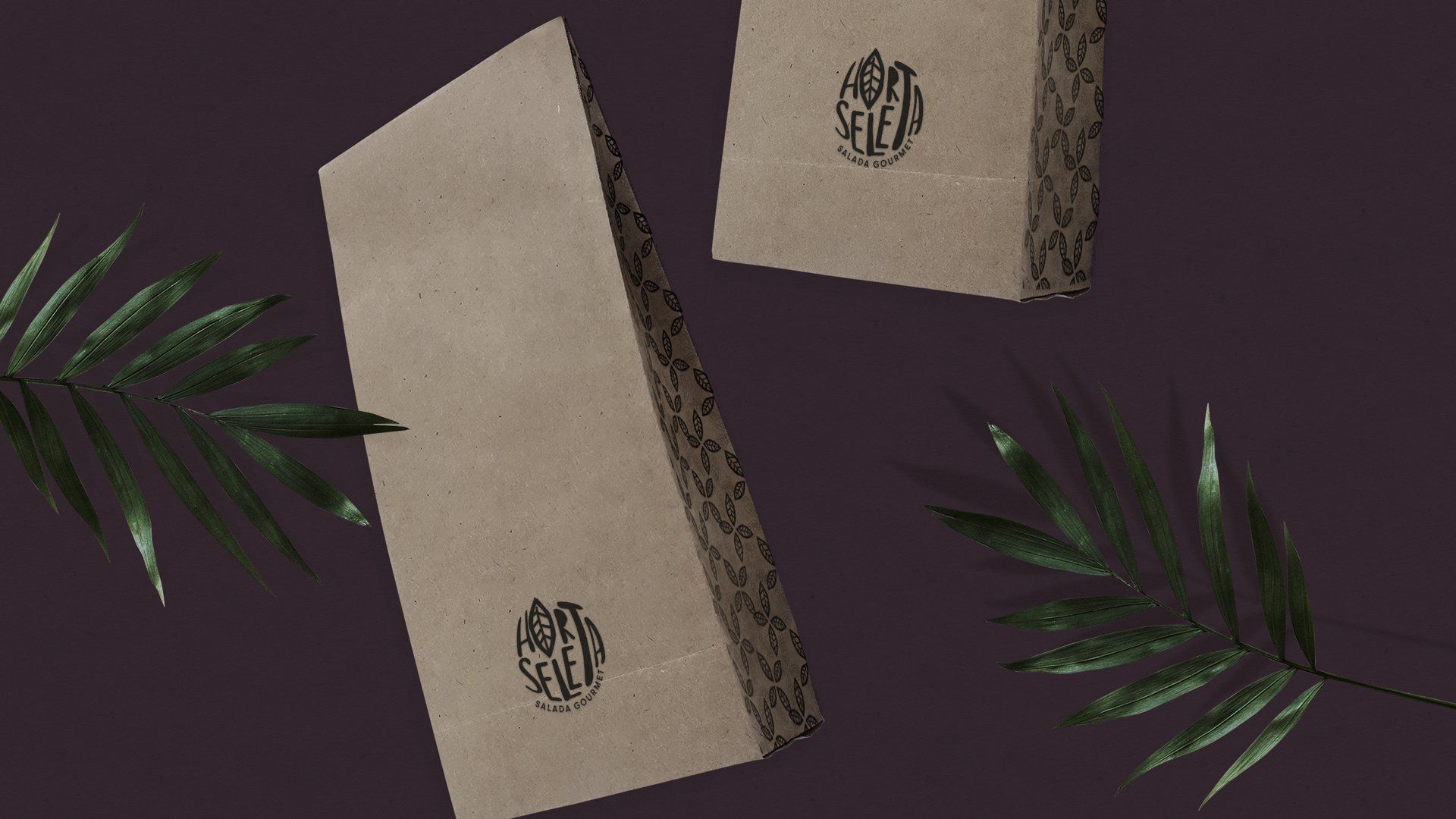
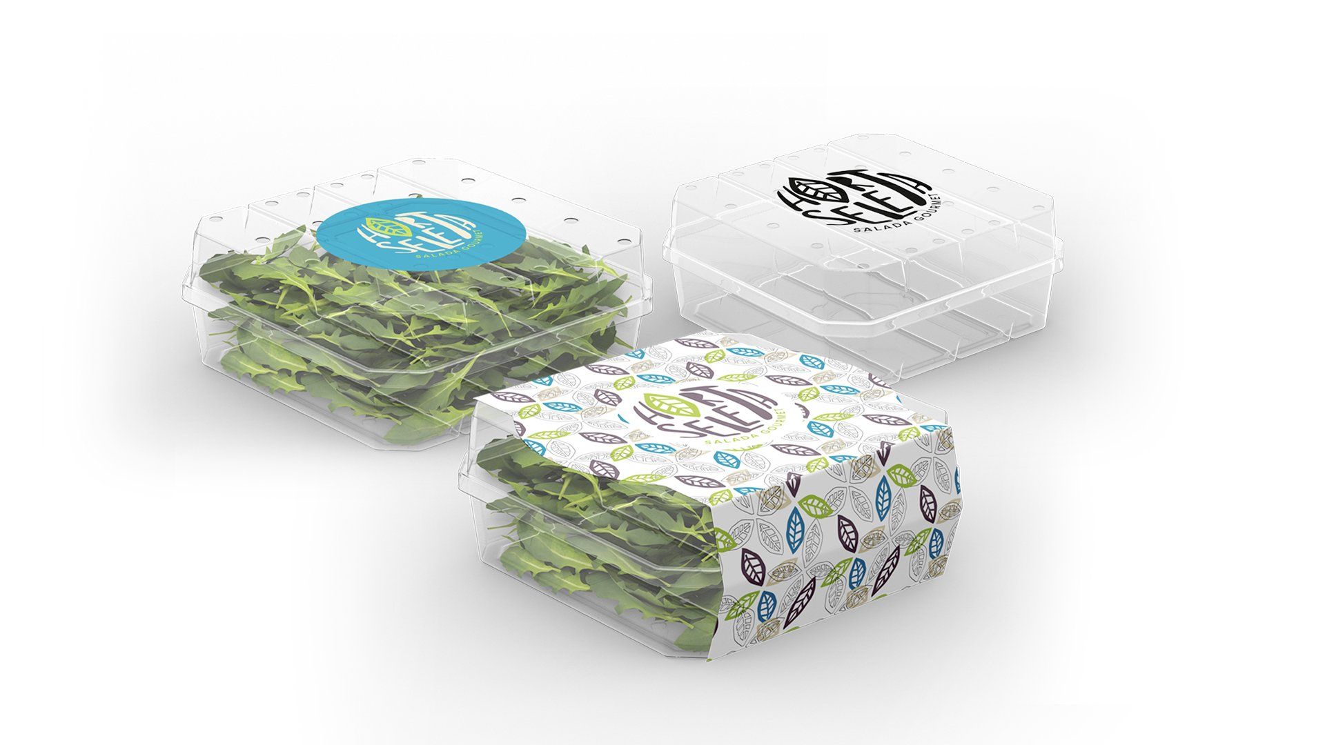
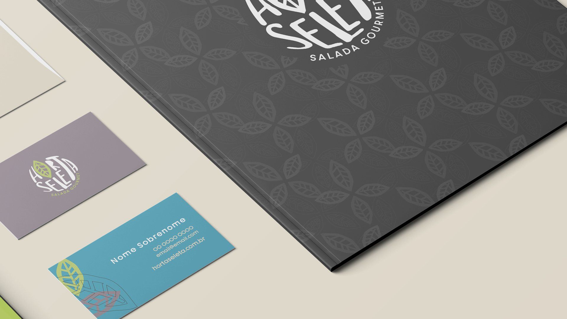
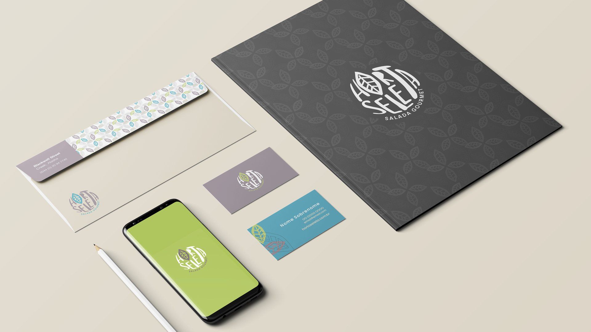
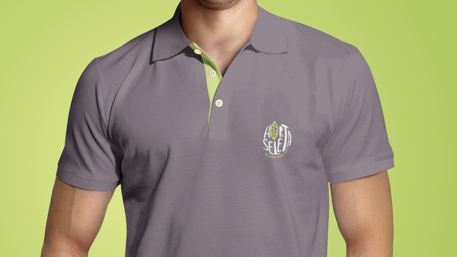
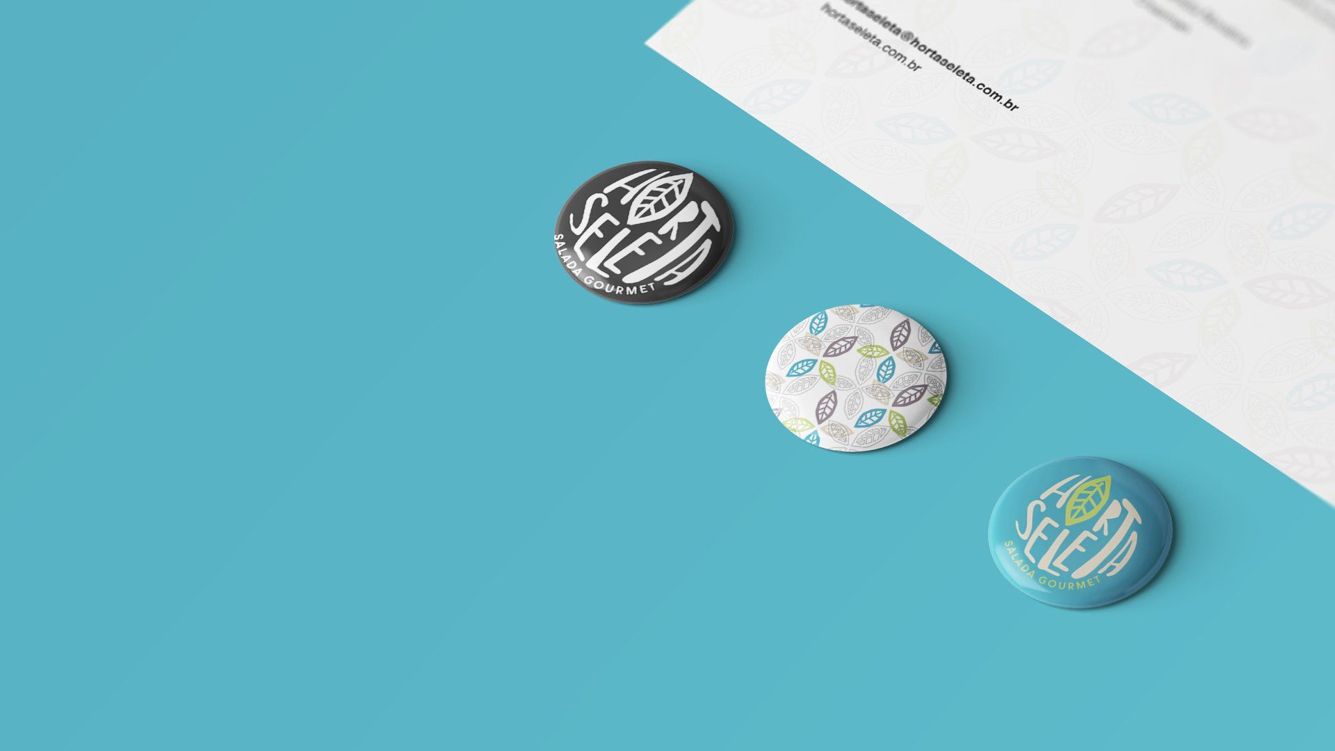
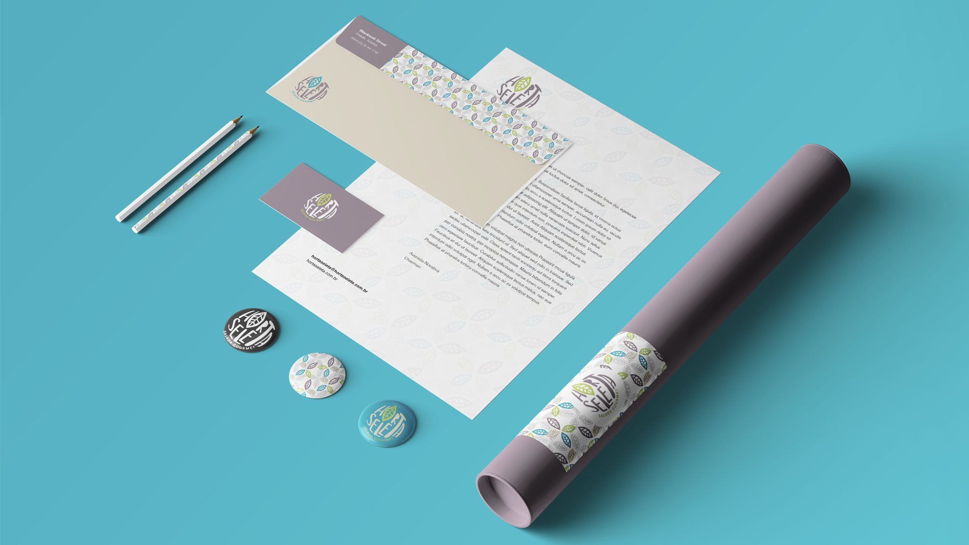
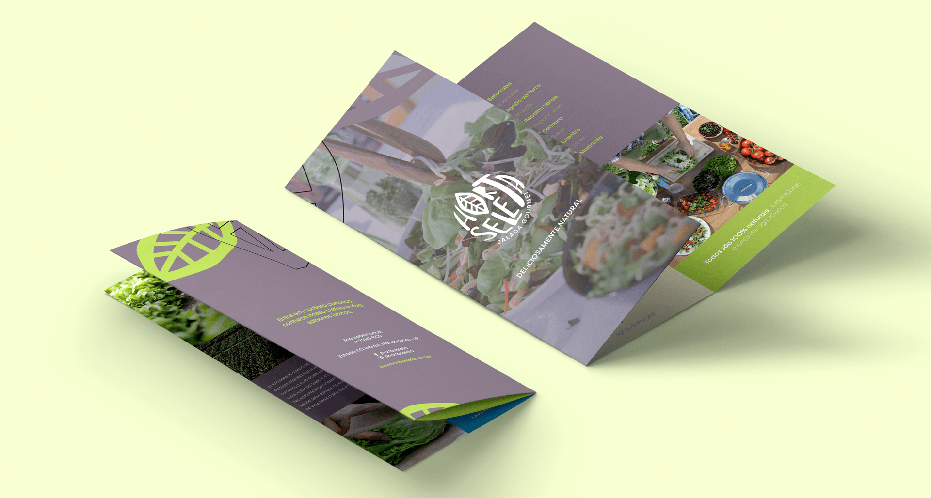
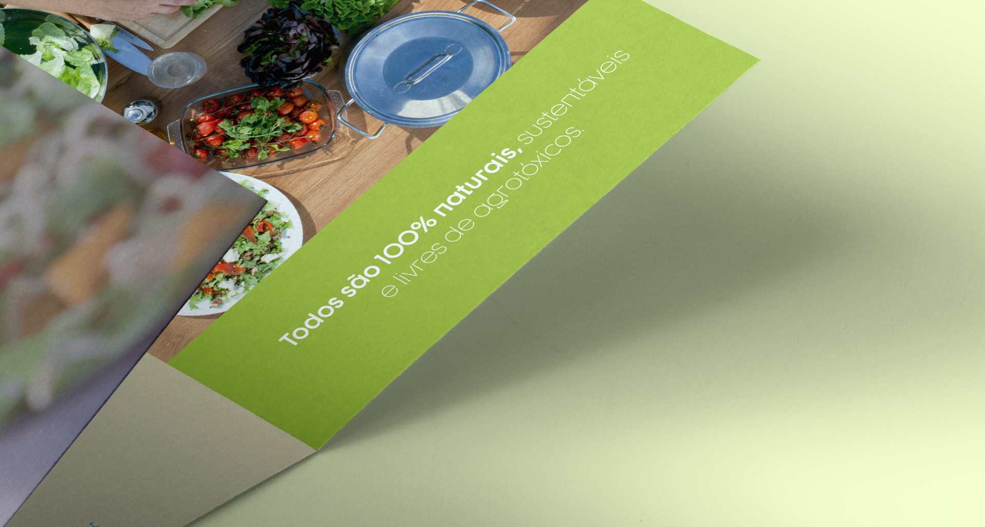
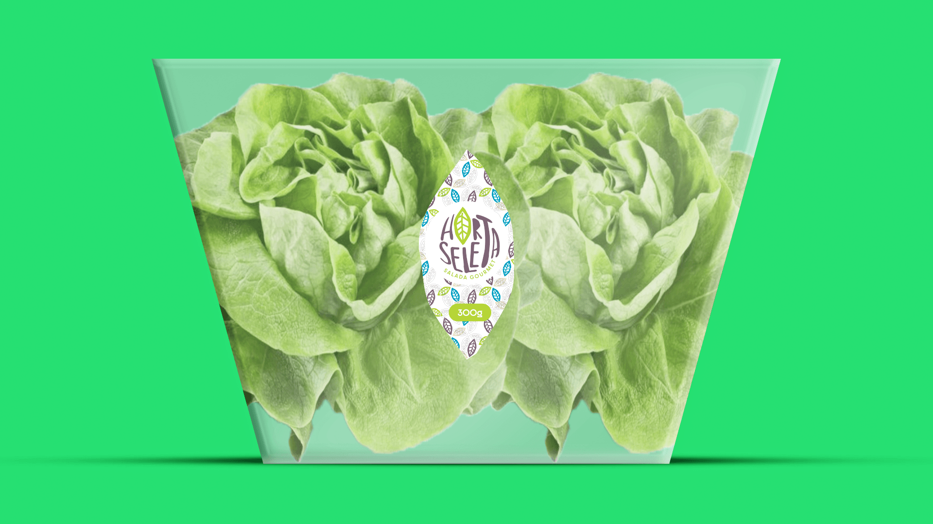
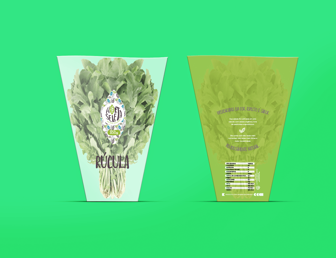
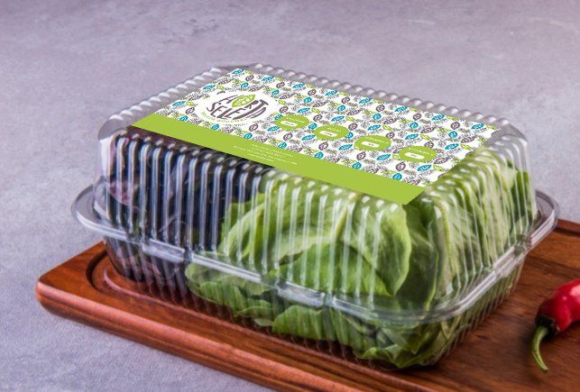
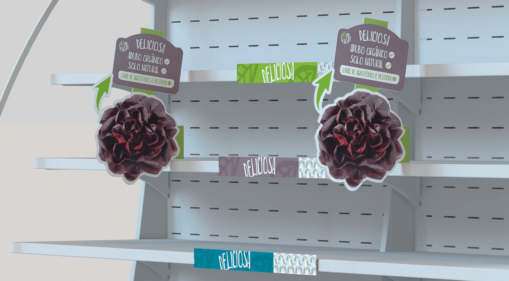
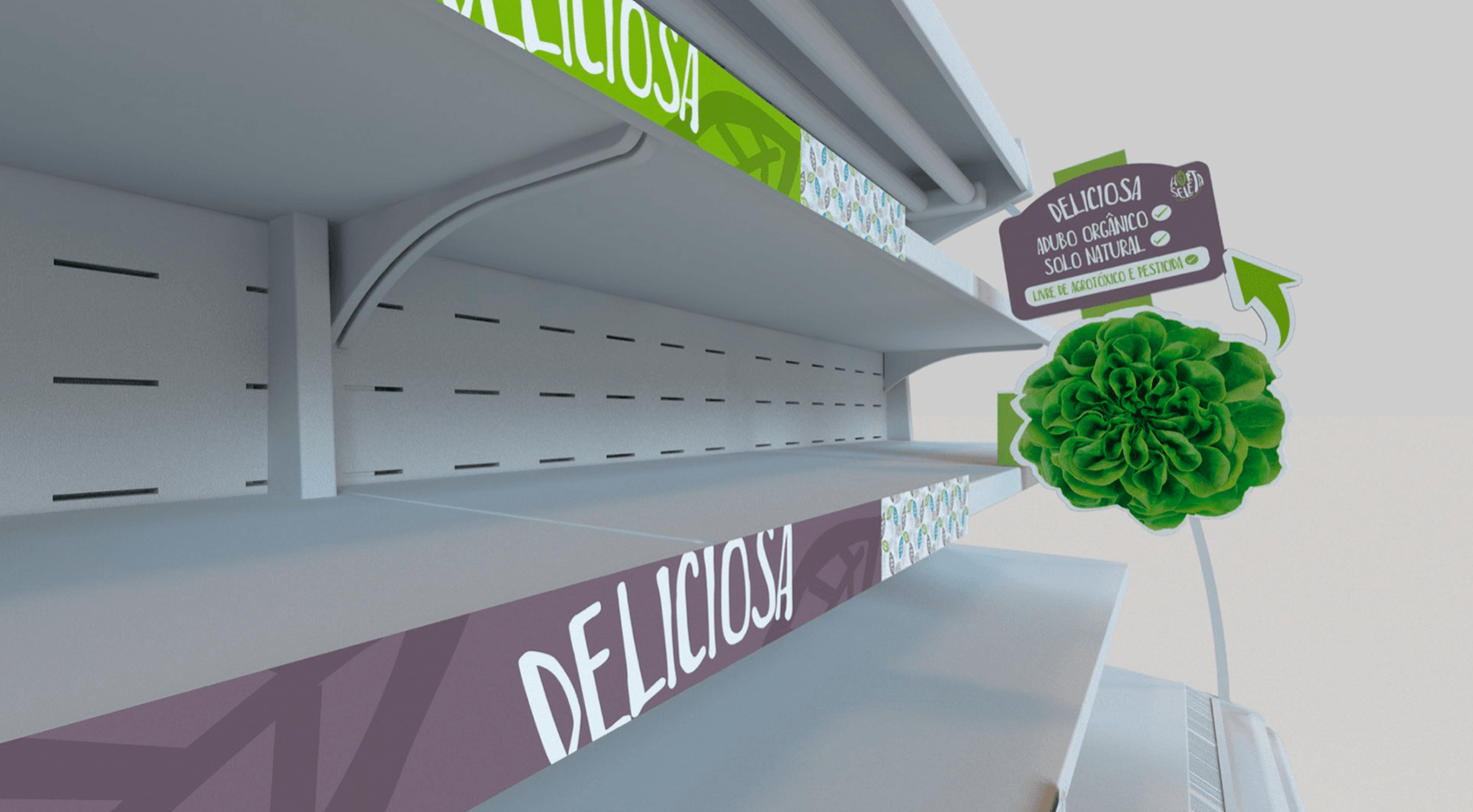
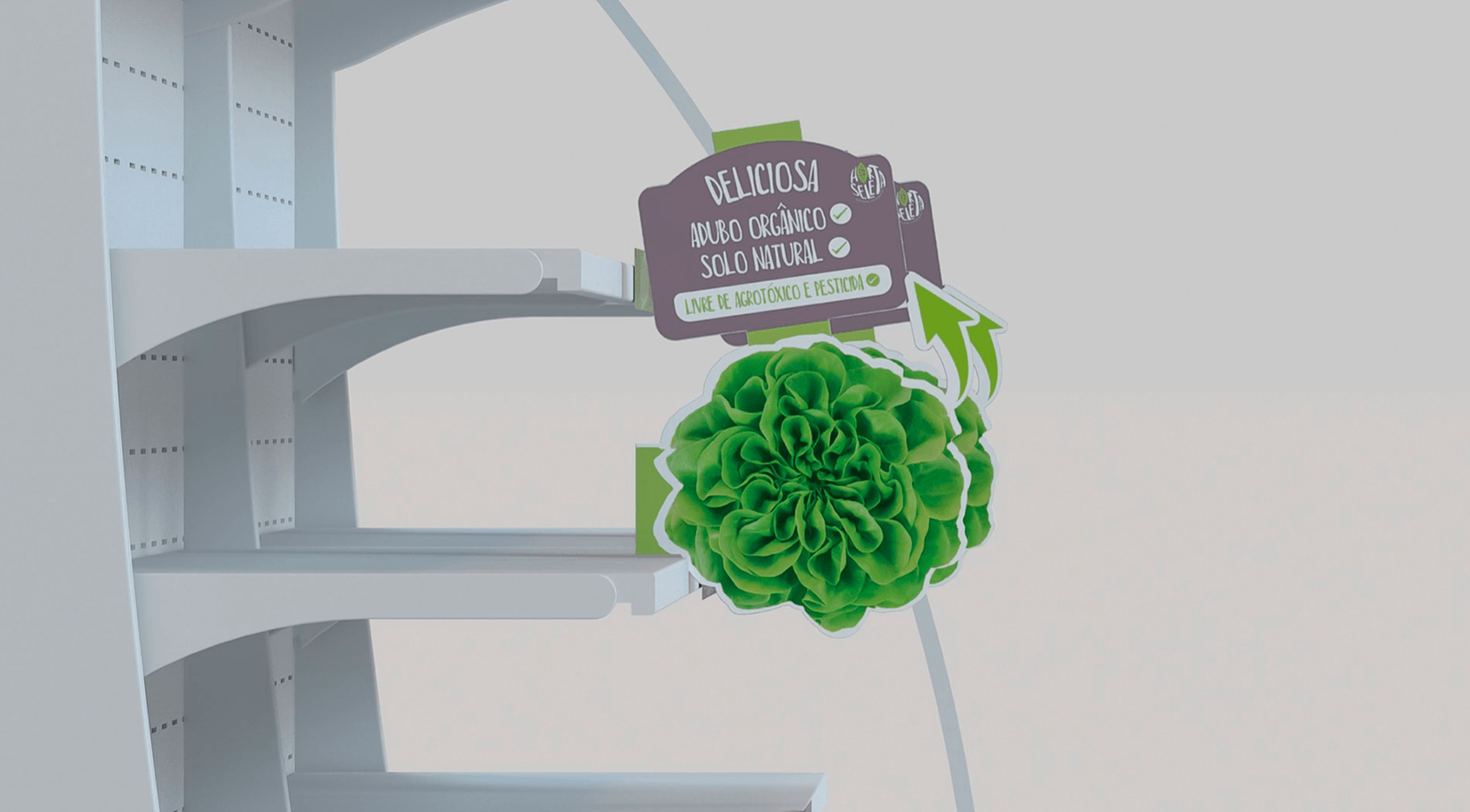
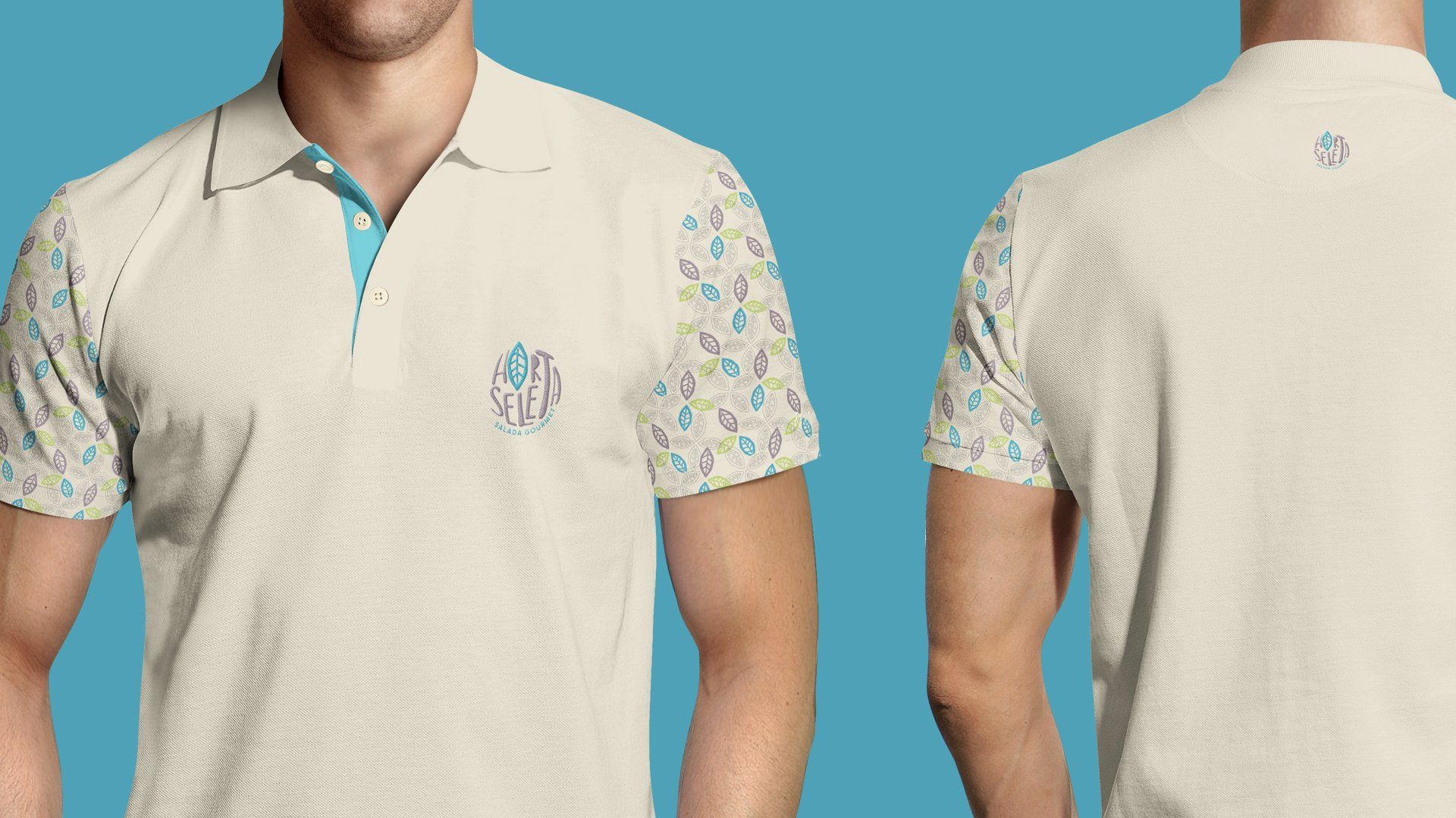
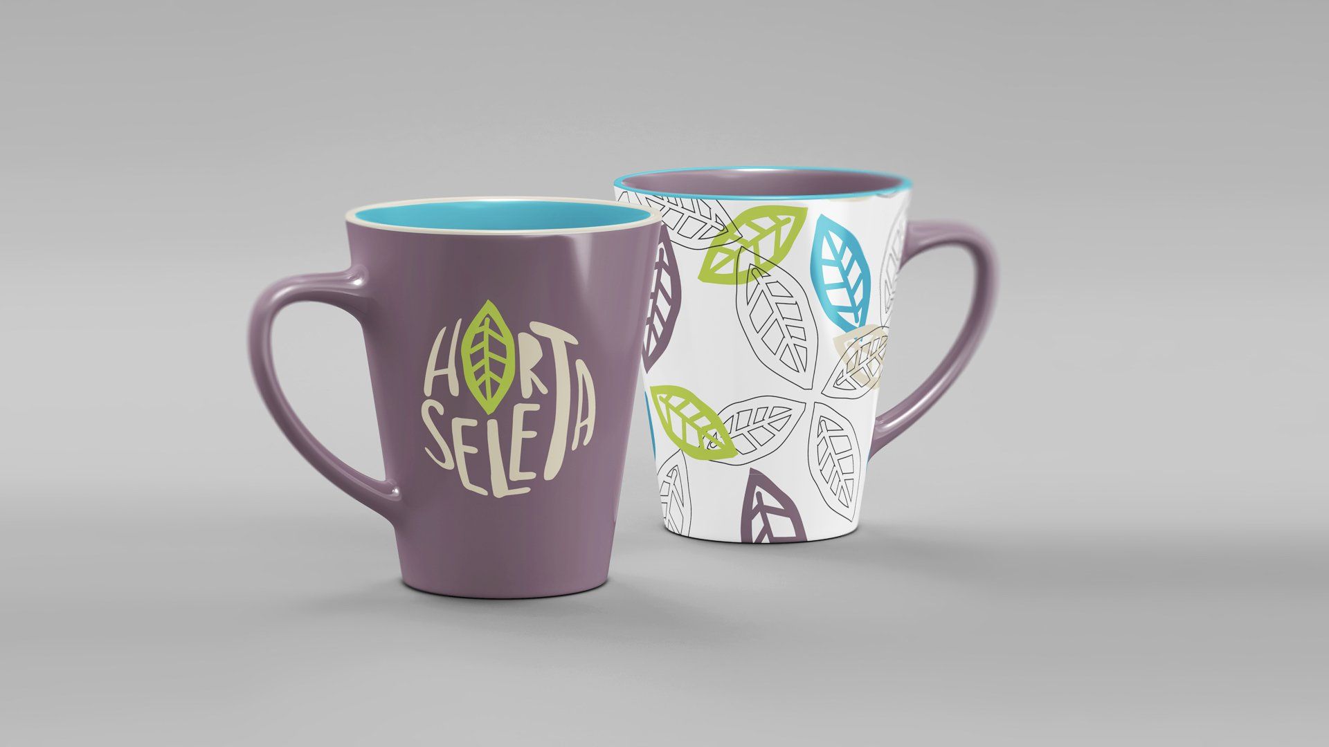
Our main reference was the leaf of Horta Seleta products and, of course, the colors that refer to nature, all in perfect harmony. The irregular font represents the construction of the plants: free, loose, fluid, as they naturally grow in their habitat – without being suffocated by pesticides. Take a look and feel this lightness in each piece:
Repositioning
TOGETHER FOR A BETTER WORLD


Horta Seleta's page is a success because we don't sell products, we sell quality of life!!
We have a product that, in addition to being good for everyone, is very tasty.
30%
AVERAGE MONTHLY ENGAGEMENT - FSI
150mil
AVERAGE PEOPLE REACHED MONTHLY
38.000
PEOPLE REACHED BY PUBLICATION
1.500
AVERAGE OF NEW MONTHLY FANS ON THE PAGE
Is your brand positioned correctly?
Have a branding that represents your company and create passionate about it.
DATASHEET
Client - Horta Seleta Job - Naming Branding Positioning Service - Carol Creation Dir - Marcio Amblard Dir. of Art - Augusto and Marcio Approval - Ildeu Canalli
LET'S TALK
Leave your email so we can talk about your project, I'm sure that together we can do something different.
< previous project
Next project >