

Branding
Client
again
Jobs

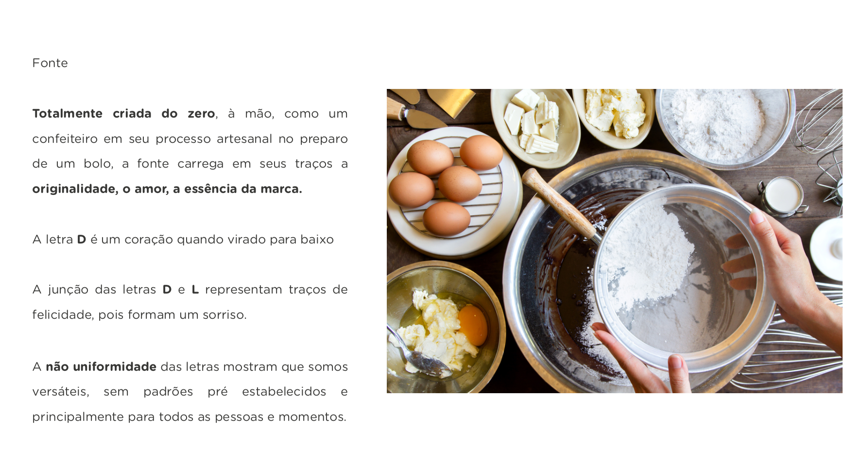


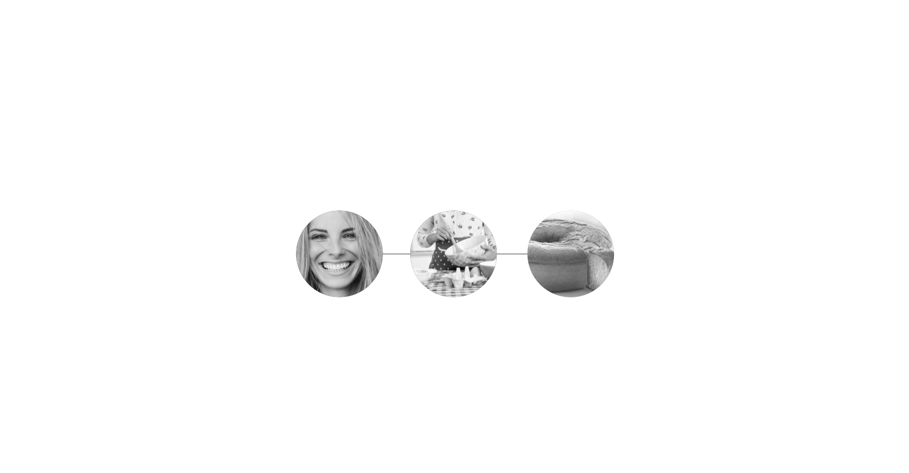
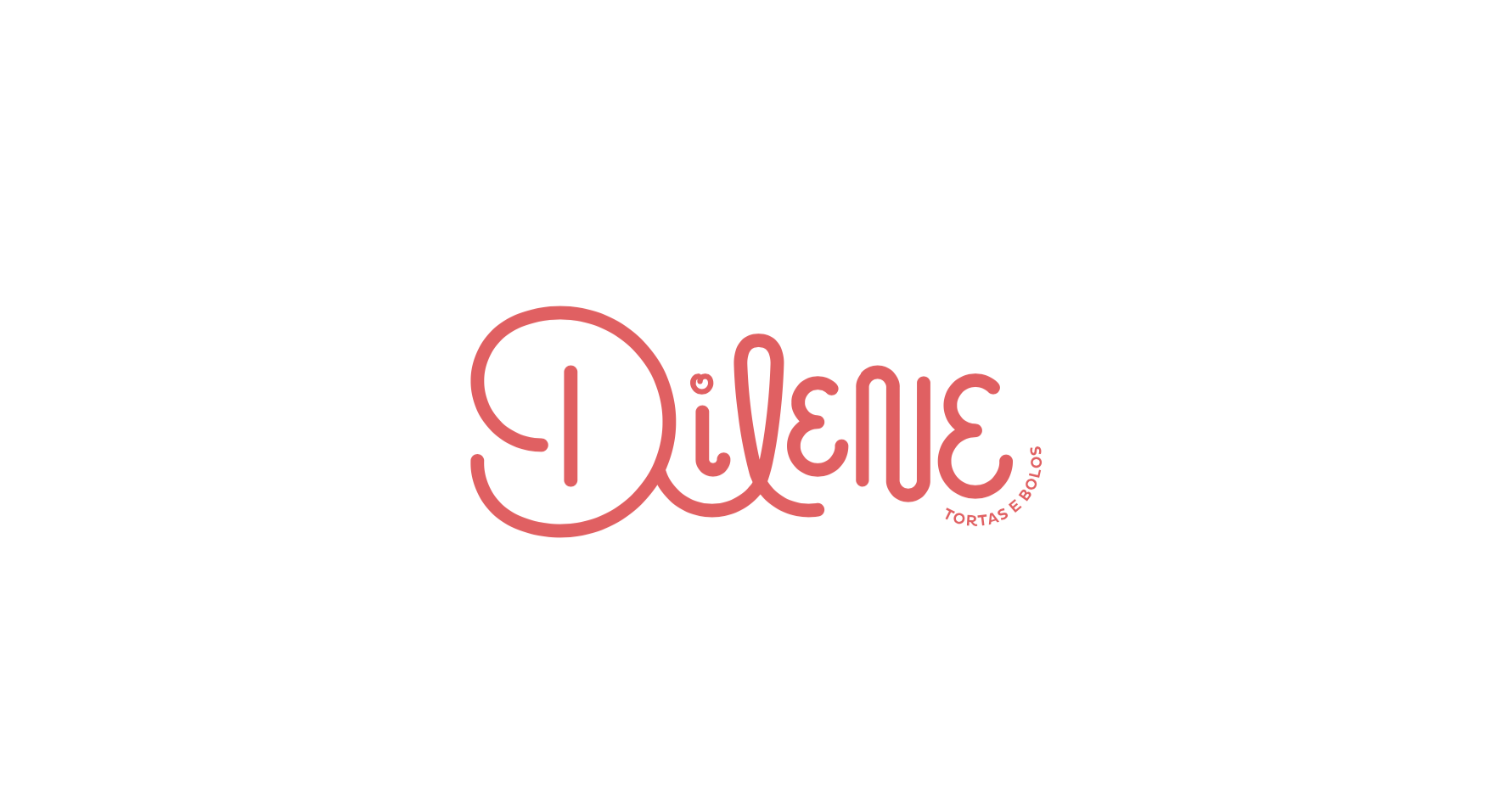
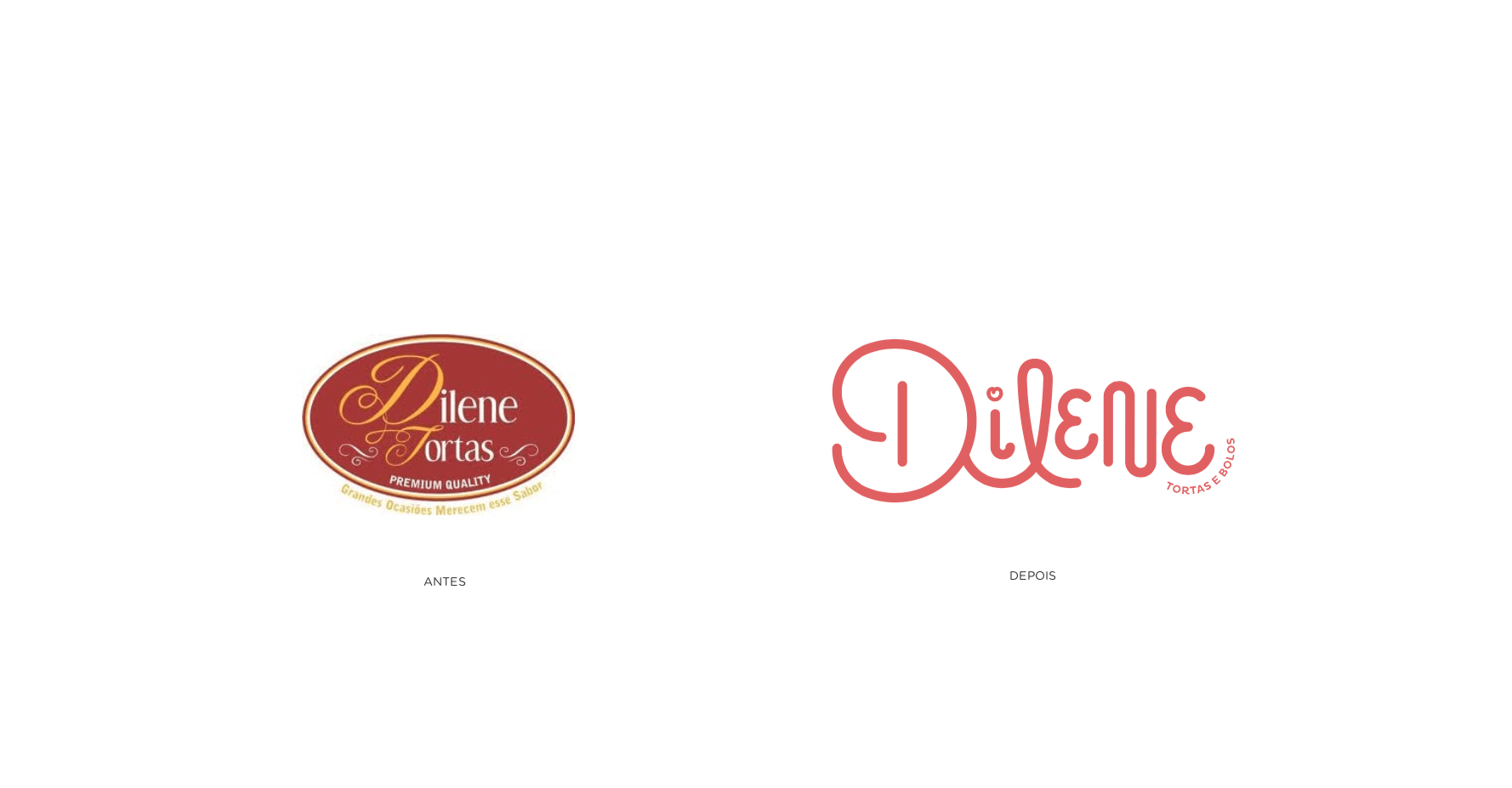
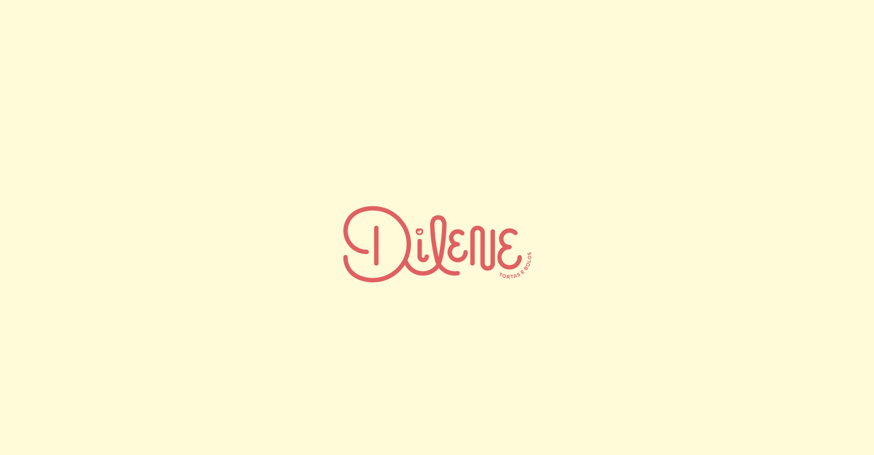

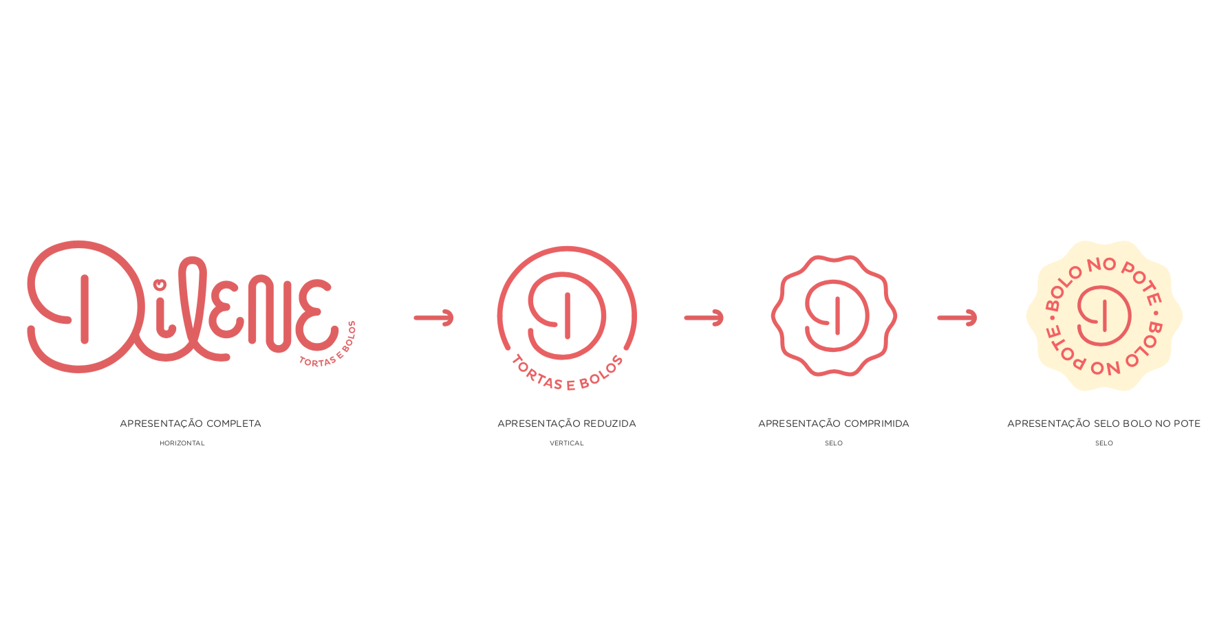
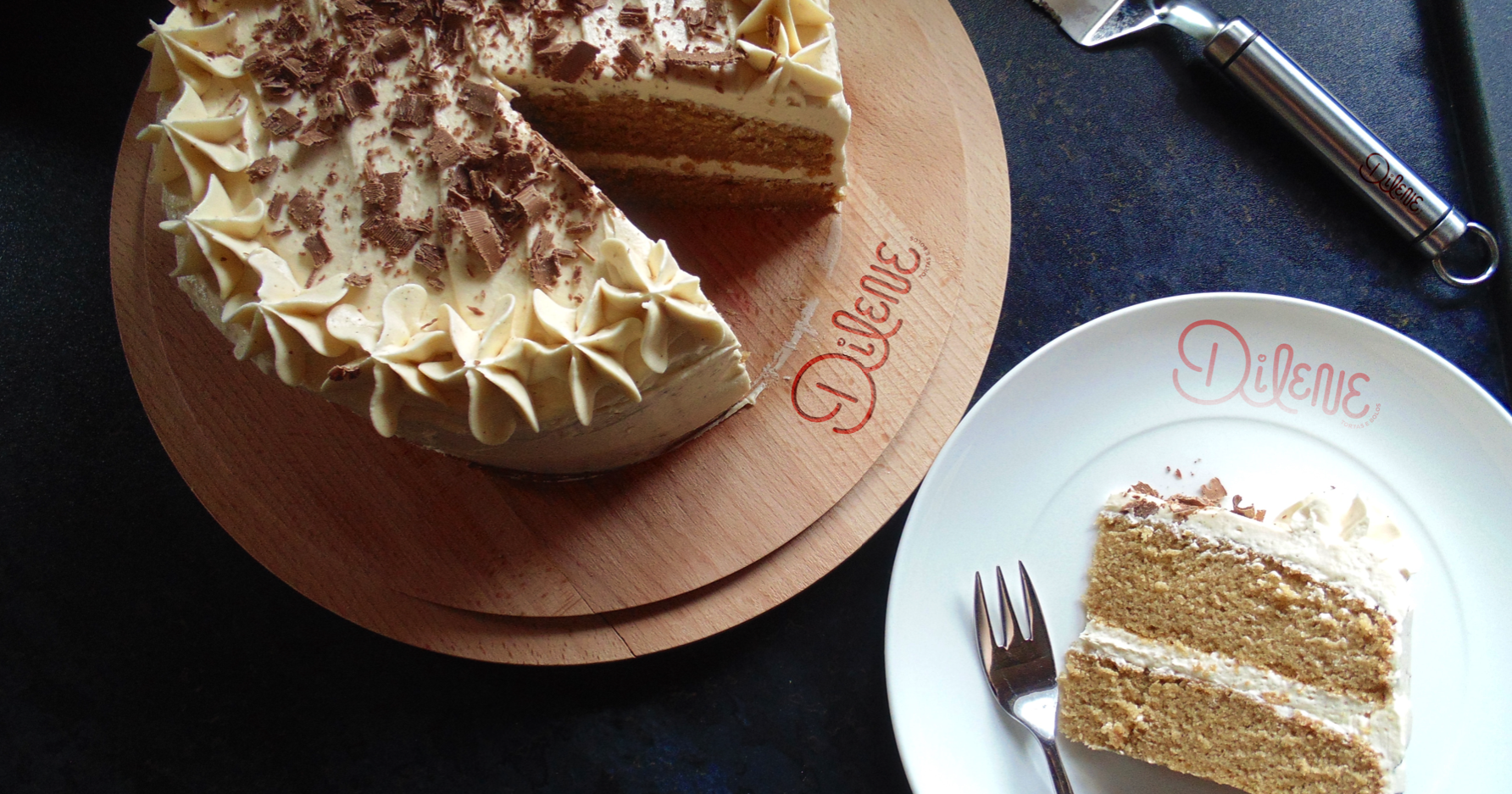

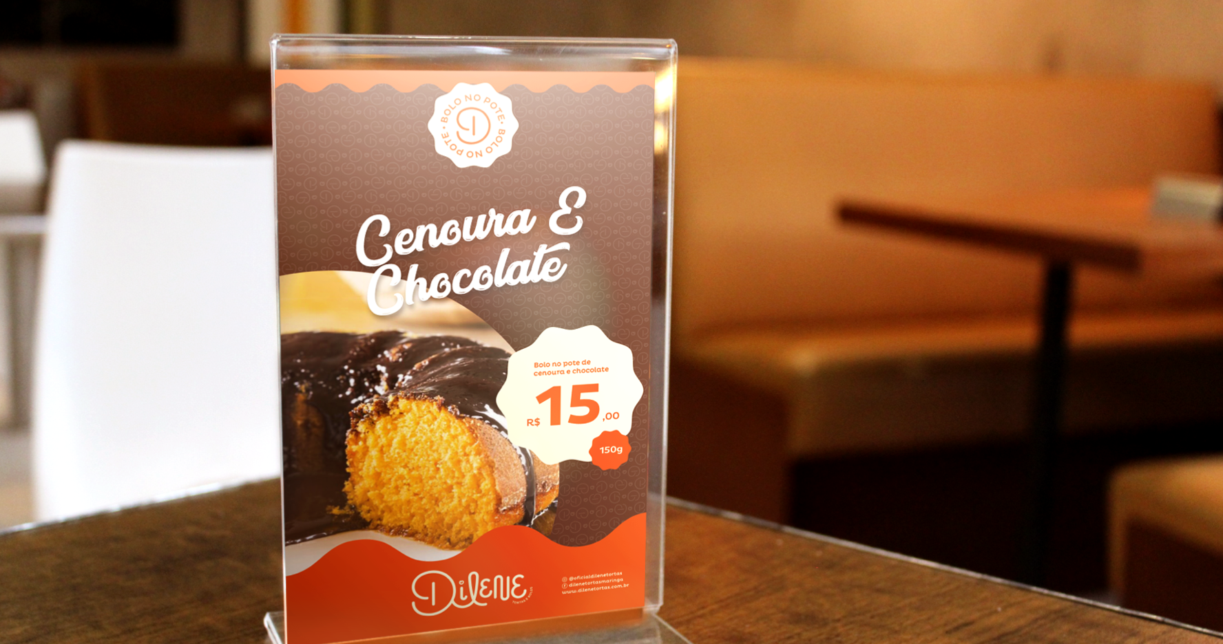
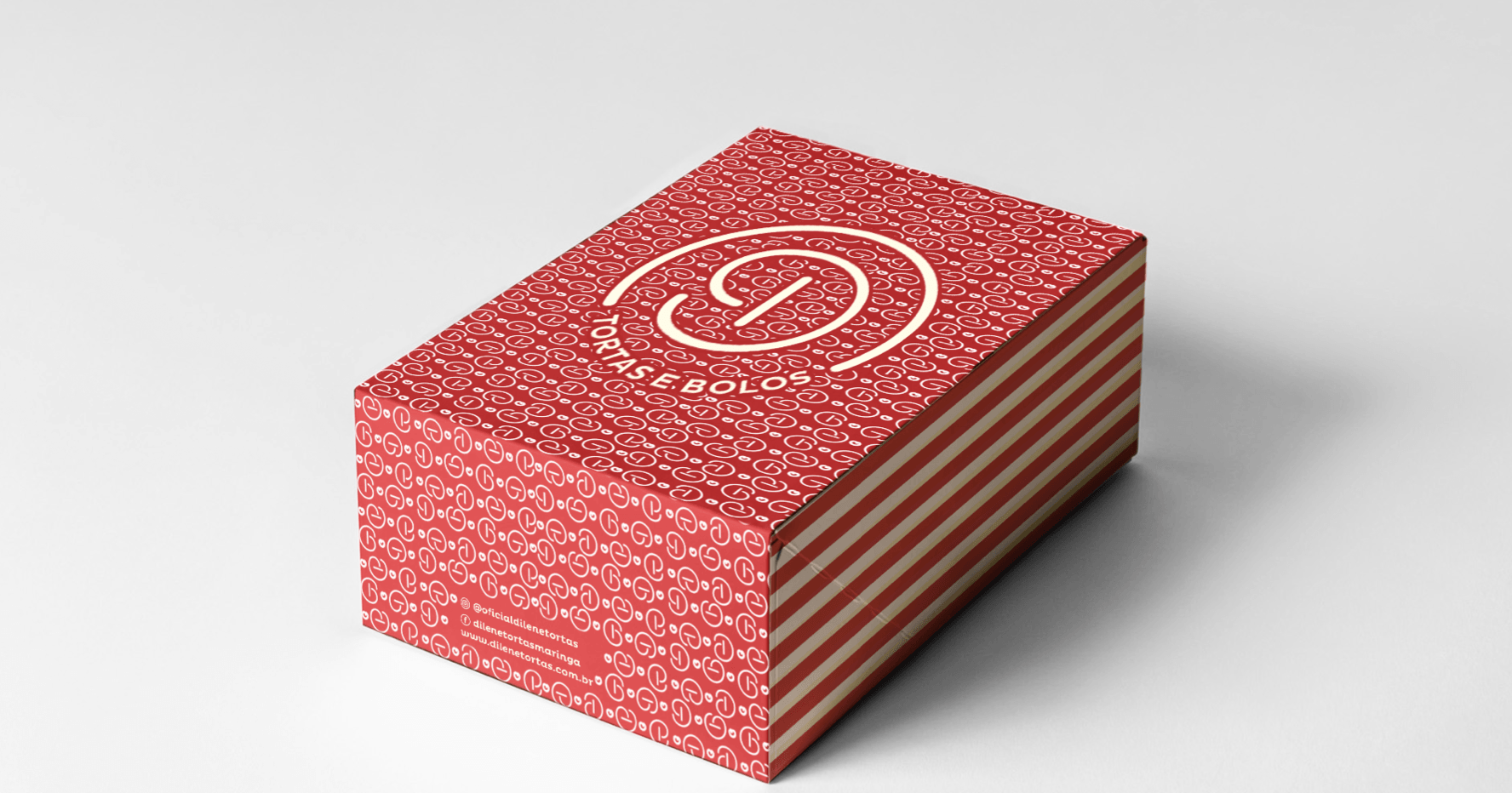
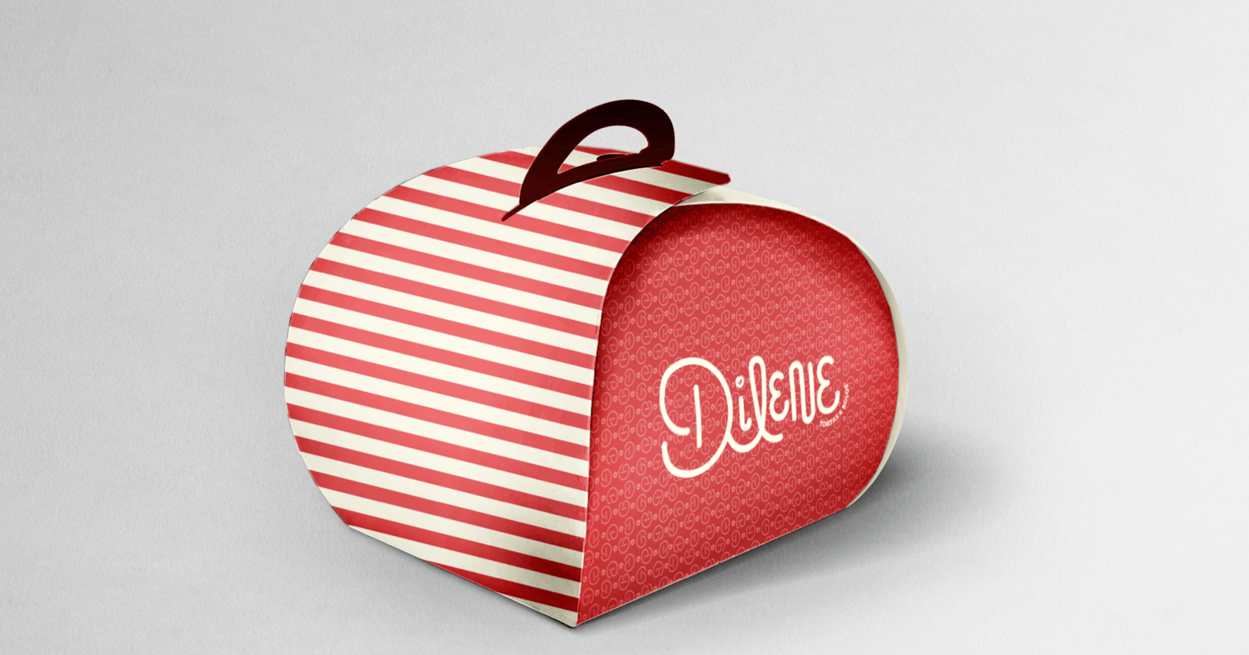
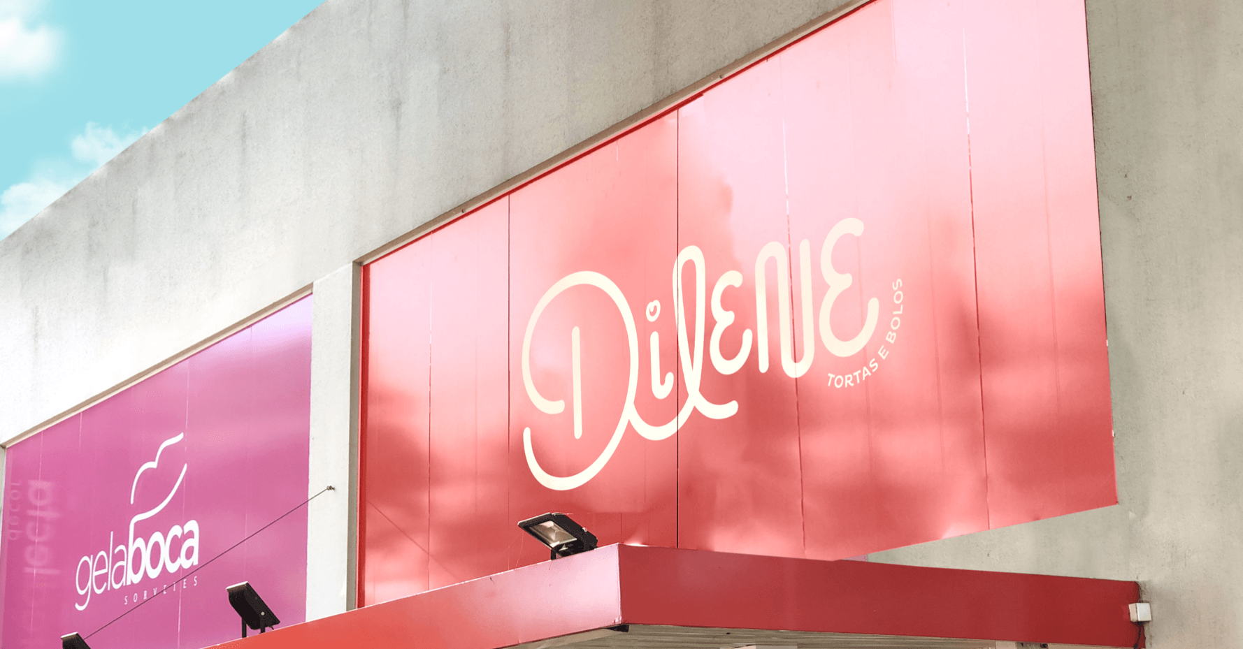
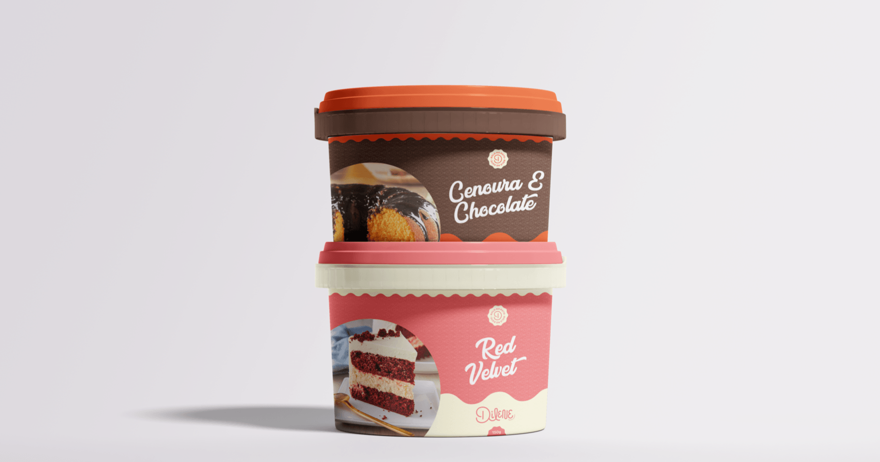
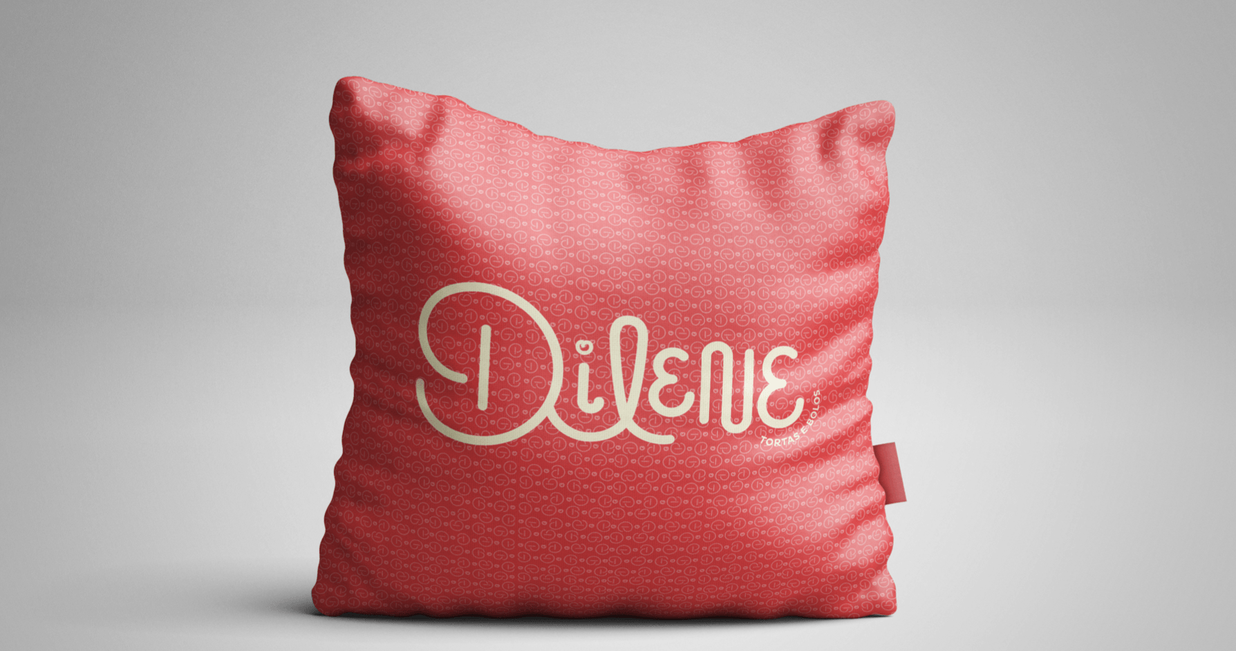
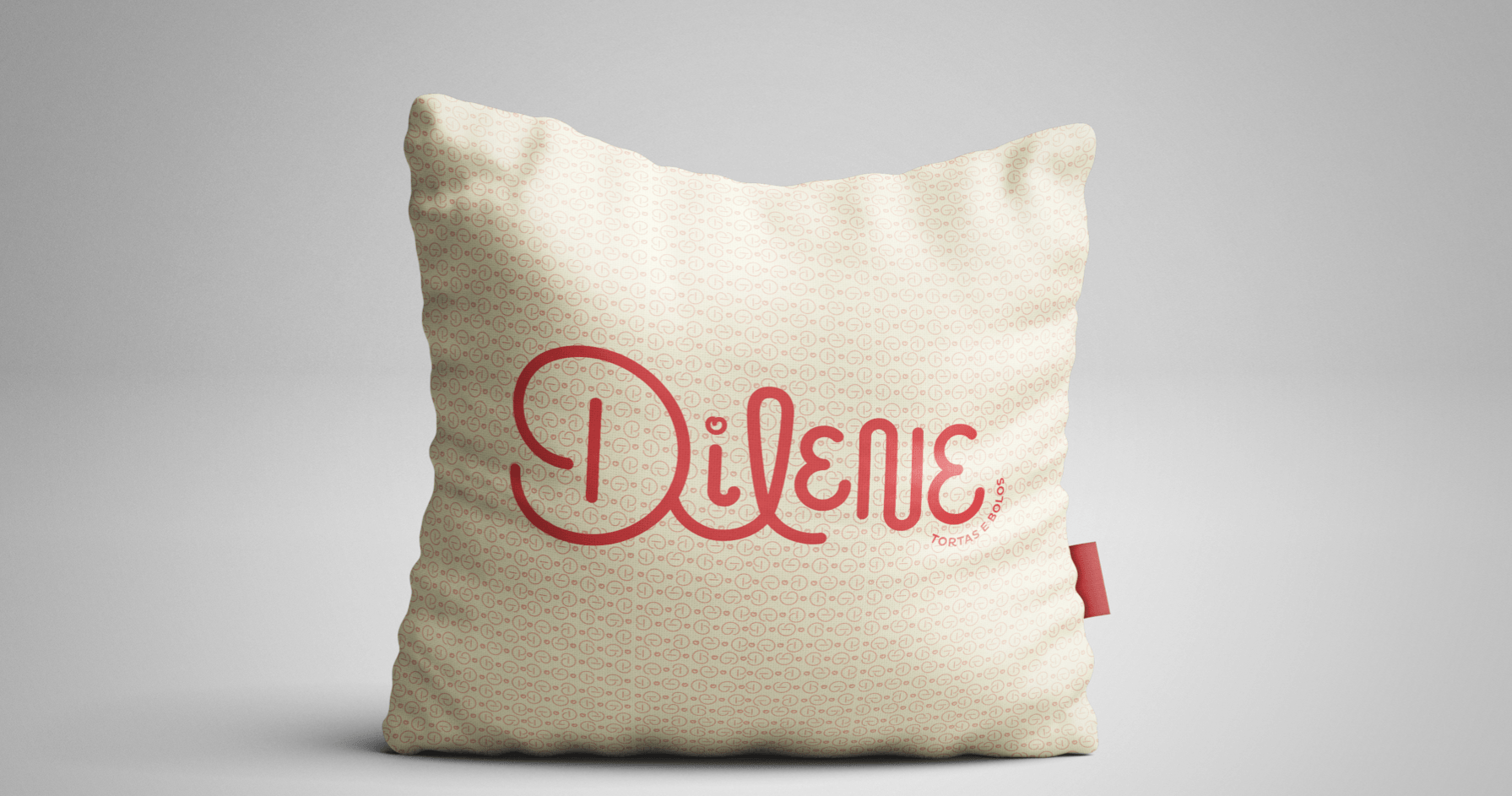
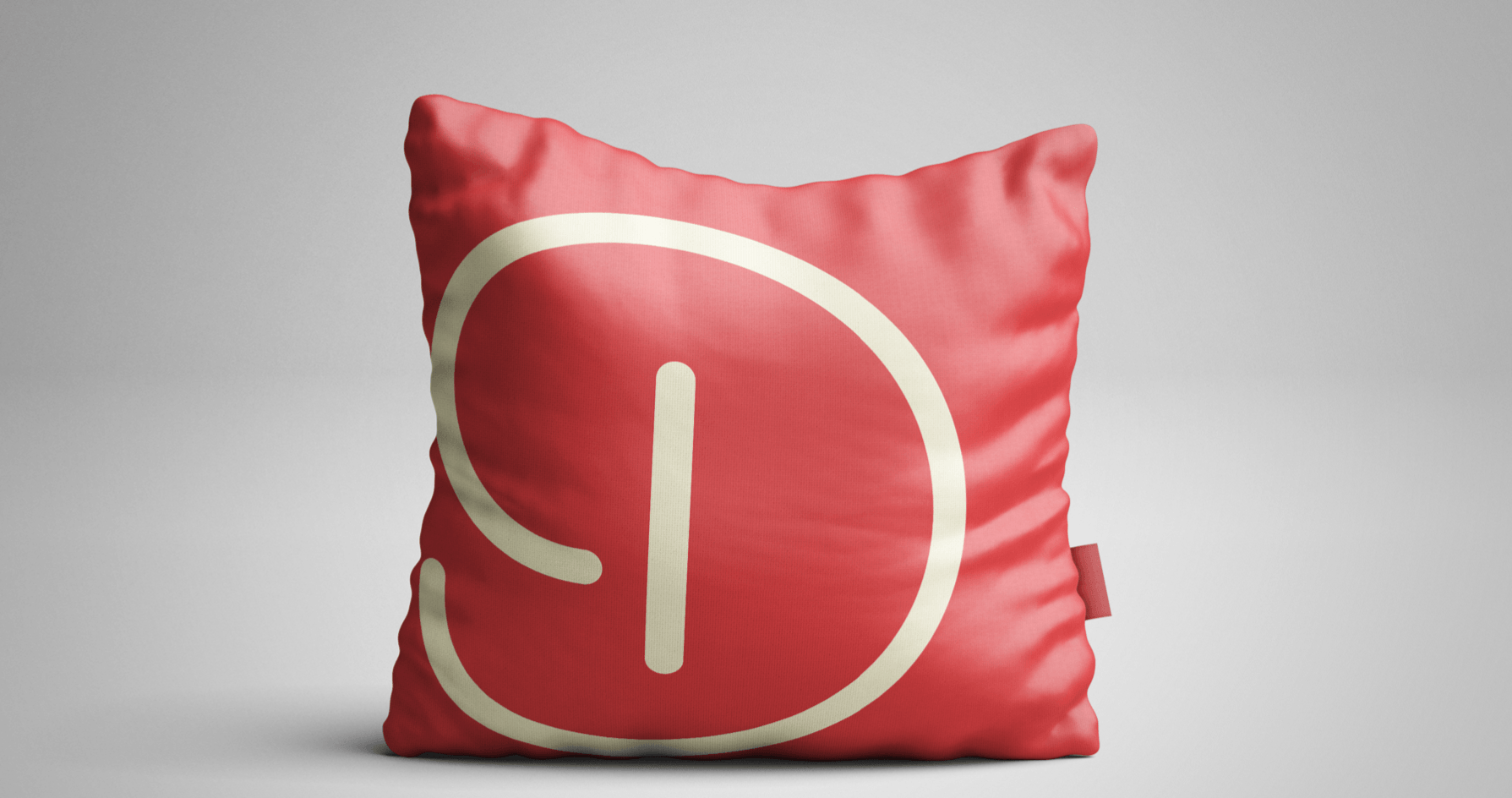
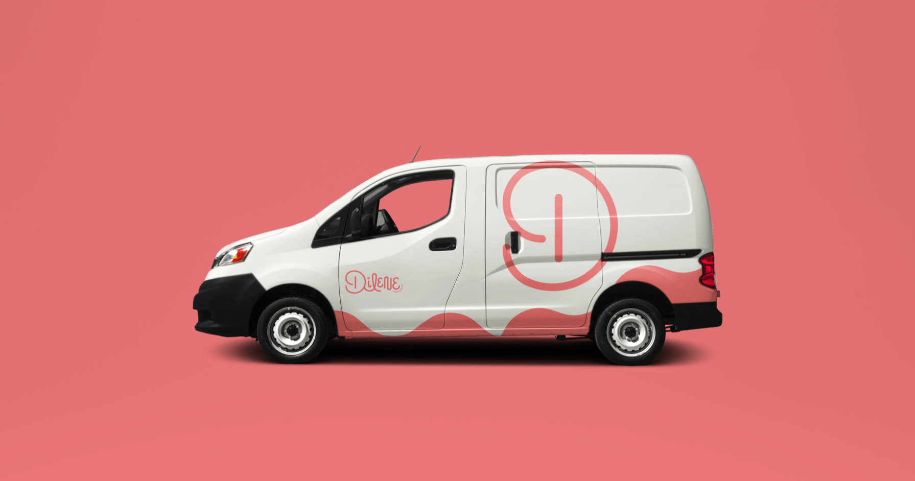
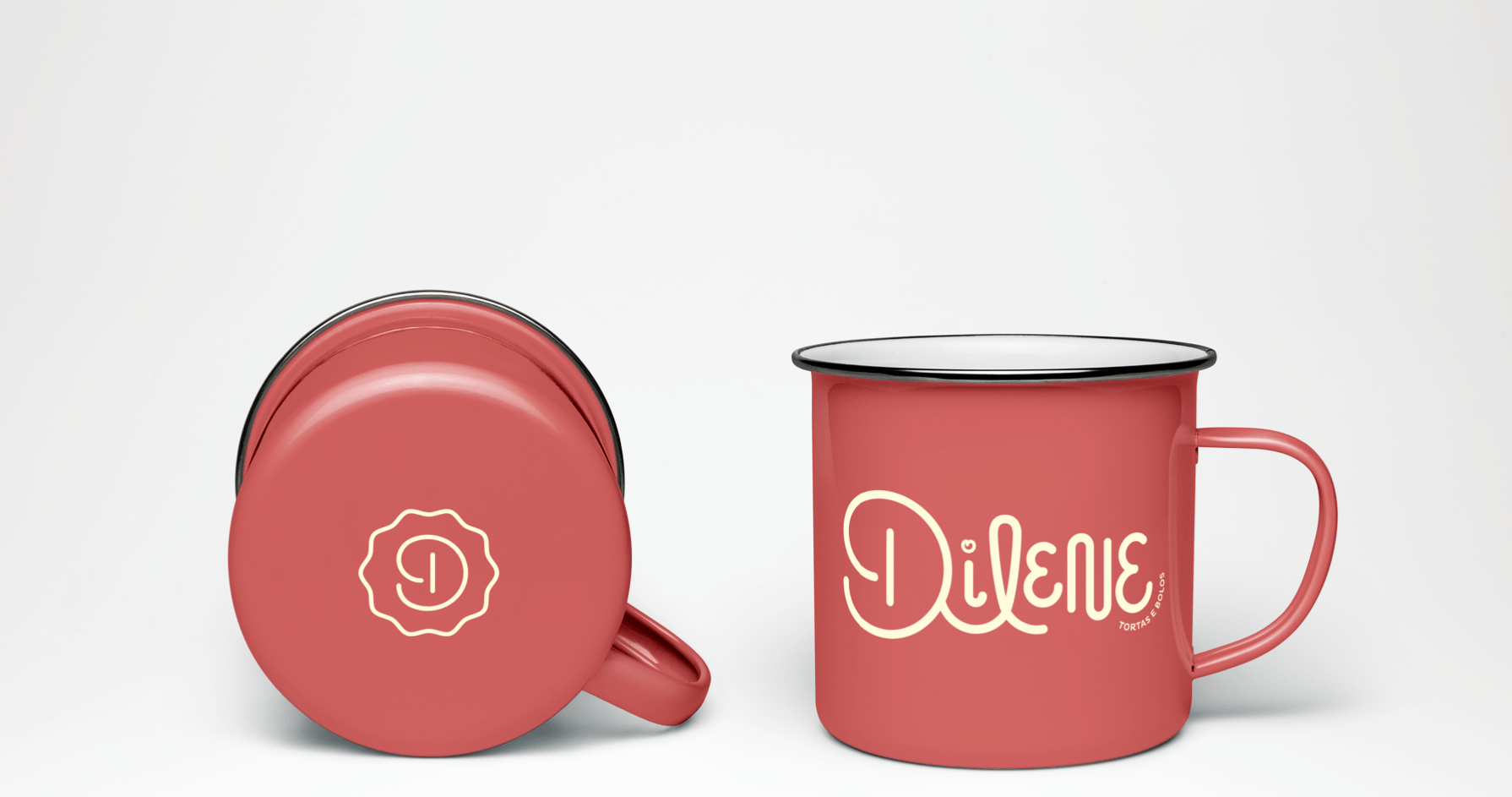

Dilene Tortas has been offering its customers products of the highest quality over the years with an unparalleled flavor. It is due to this commitment to always offer the best, that we are gaining more and more confidence in the preference of the consumer public. Each letter was thought and designed from scratch. The “D” forms a heart, showing that each cake is made with it, and its combination with the letter “L”, a smile, an expression caused by the striking and special flavor of each ingredient.
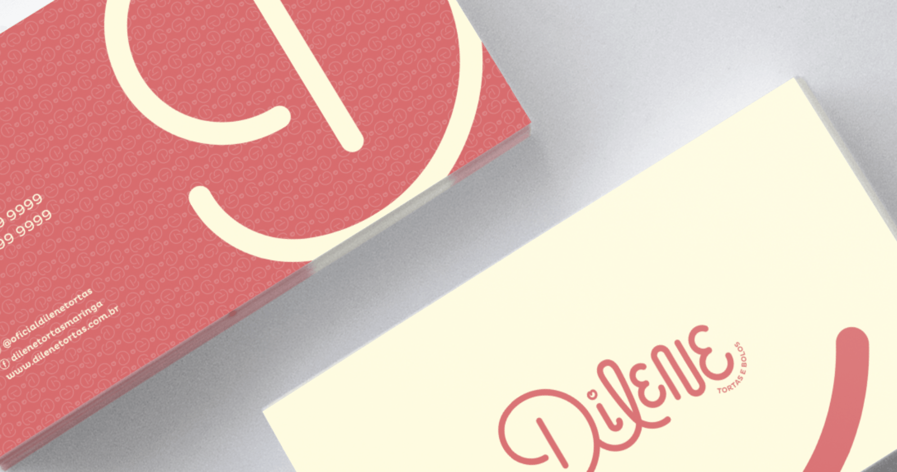
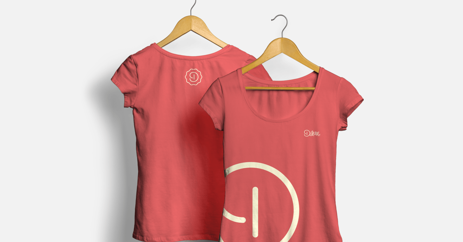
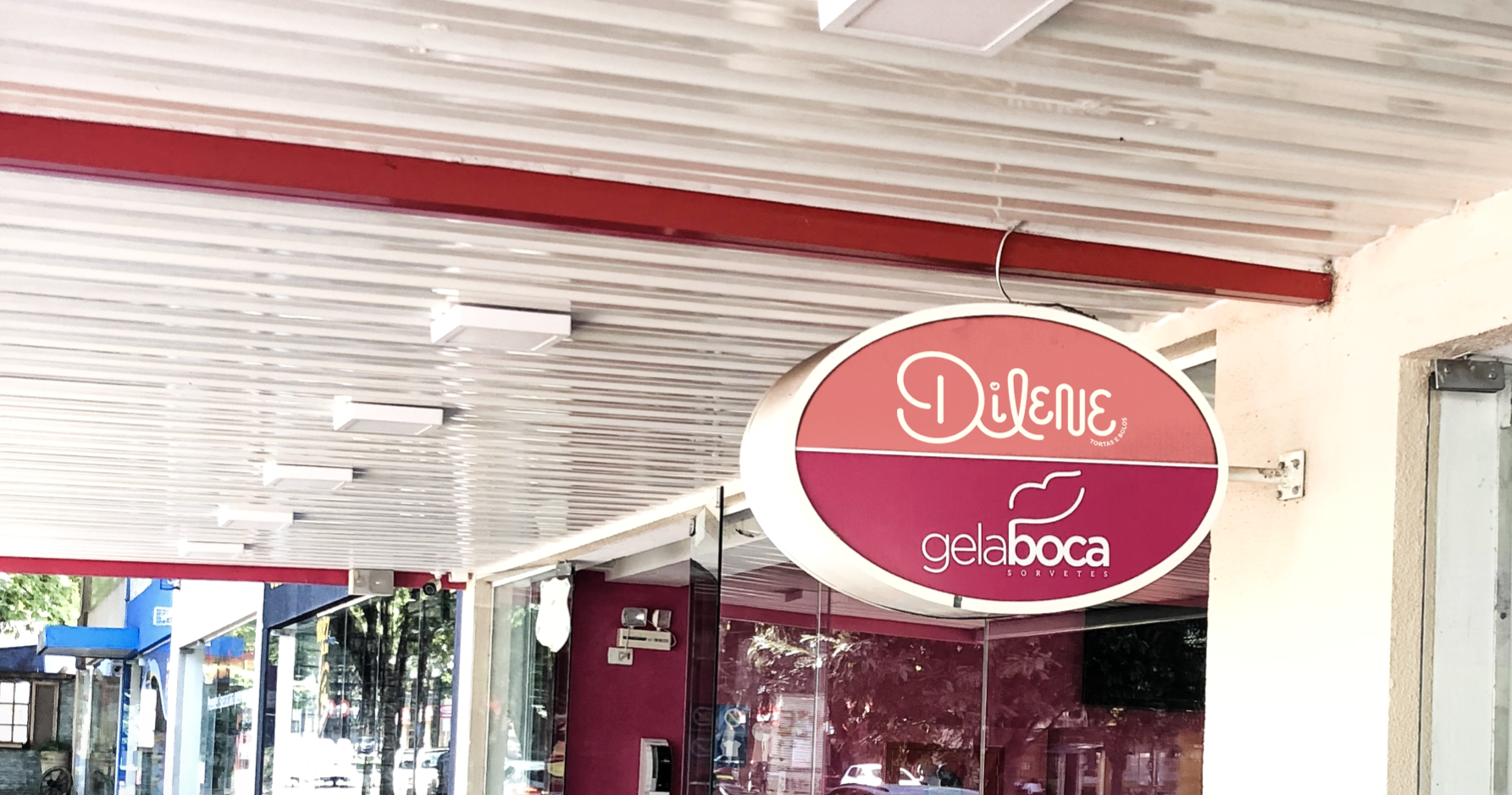
Its font carries the originality of the brand, as it is unique, handmade (just like the confectioner in his artisanal process in preparing the cake).
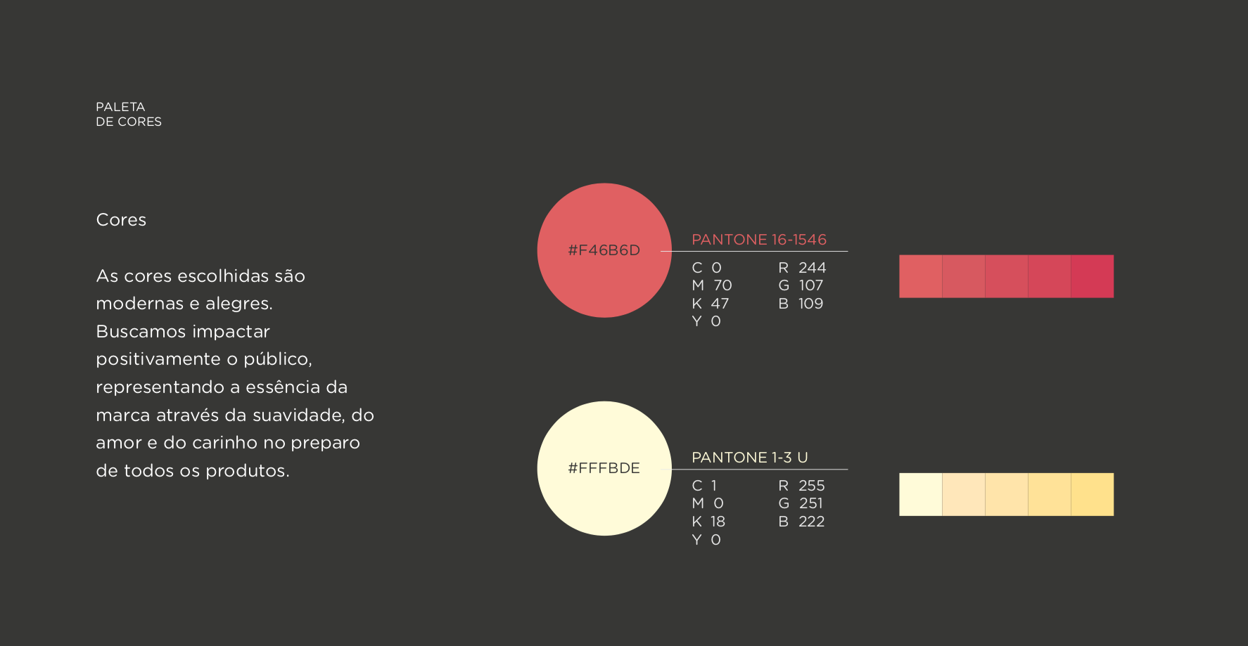
The chosen colors carry the positive impact that the brand will cause with a new face, because in addition to being modern, they contribute to represent the essence of the brand, showing the softness, love and care in the preparation of its products.
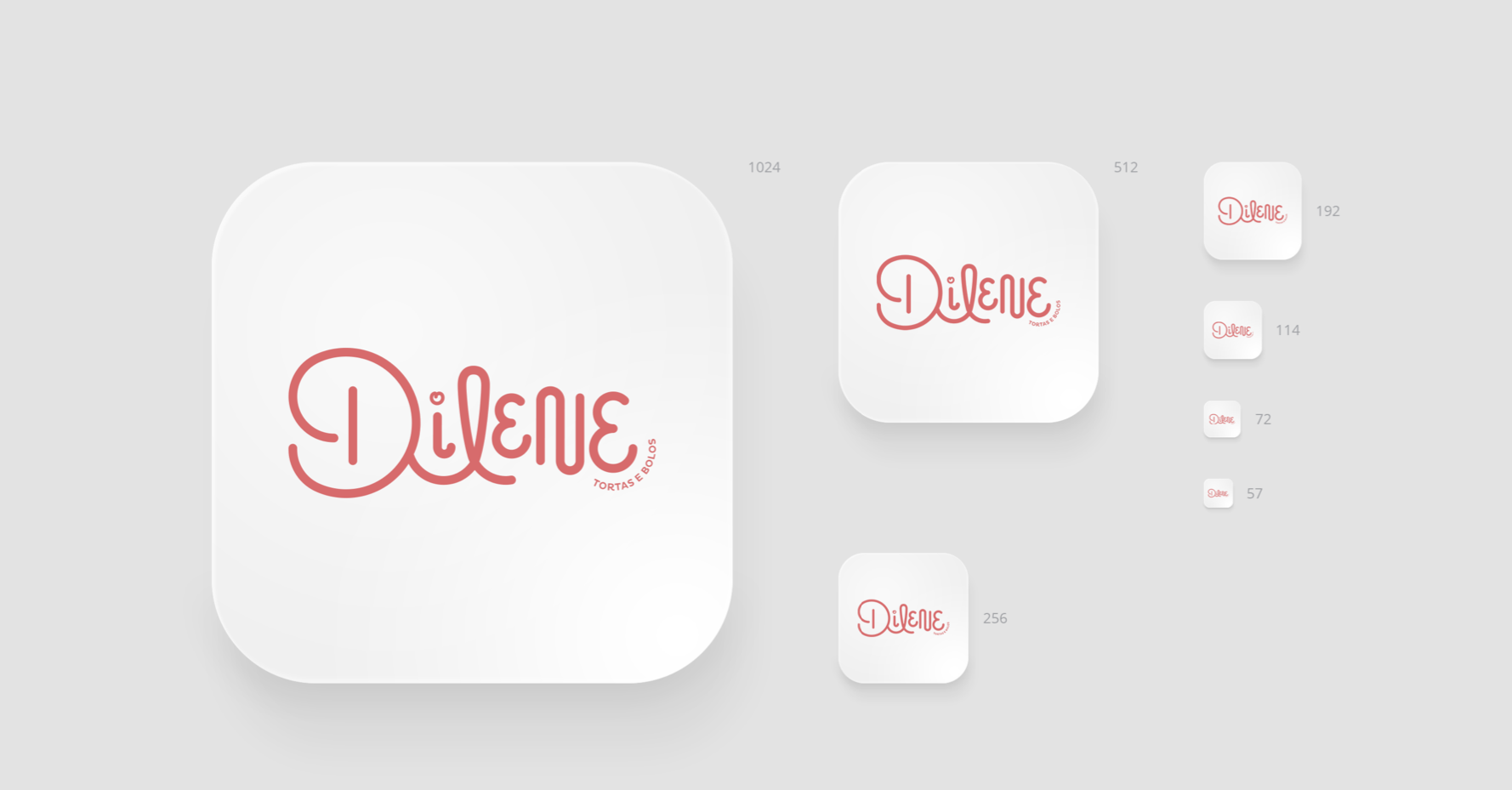
DATASHEET
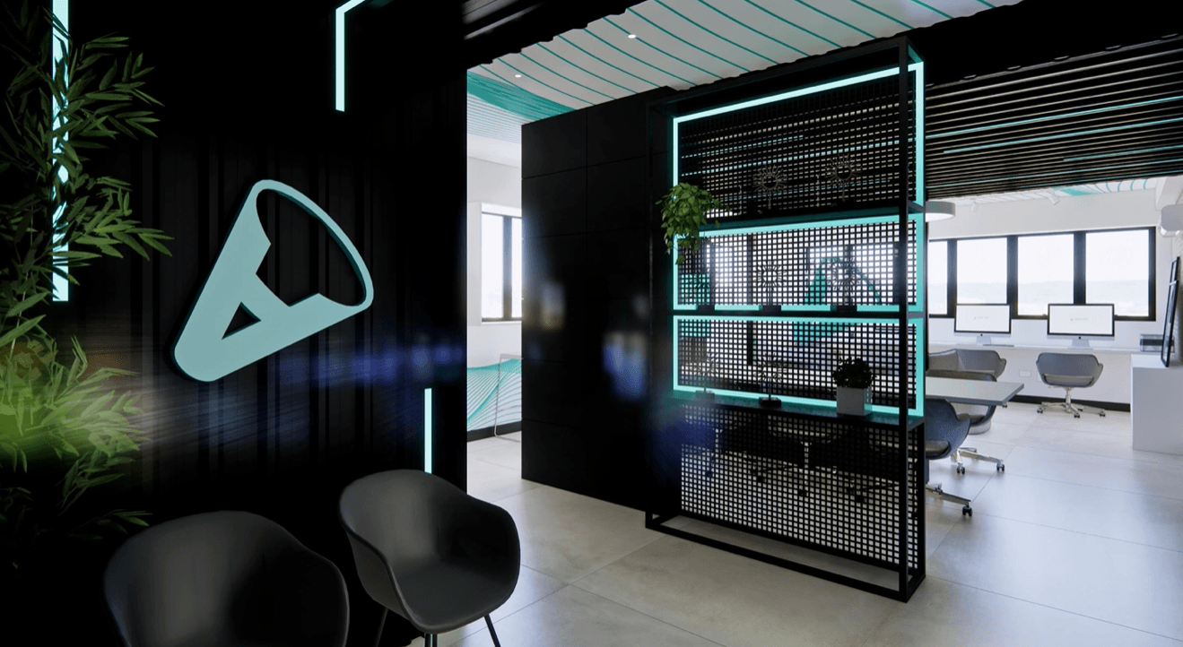
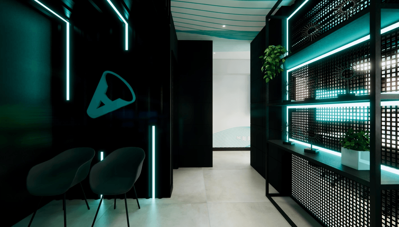
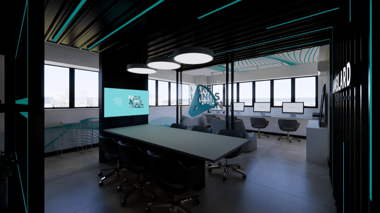
Is your brand positioned correctly?
Have a branding that represents your company and create passionate about it.